
I've been toying with the idea of keeping some sort of online record of what I'm doing for a while - I had an account on DeviantArt when I was about 15 and have had a Flickr profile since about 16 or 17, and Flickr has done a bloody fantastic job of being a place where I can upload my images and share my small thoughts. But sometimes I have big thoughts, internet. And Flickr, to me, doesn't seem to be just right for my big long thoughts.
WELL THEN, I thought, what would be an acceptable first real post for this new platform? Where I can not only share my photography, but also where I can write things down and people can read them?
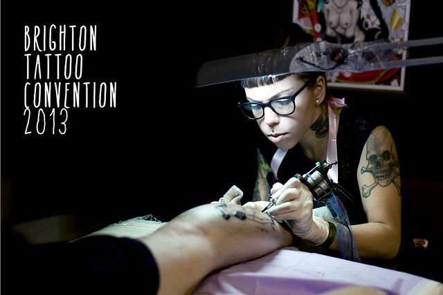
Tattoo Convention!!
Just to clarify, I really like tattoos. I love the variety in reasons, meanings, styles and subjects, which is what makes going to a tattoo convention so much fun. As soon as you get through the door, you can hear the dull hum of a hundred tattoo guns at work, each creating something special for someone.
It was a perfect opportunity to take a huge load of photos to kick off my new site....
...so I obviously ignored what I wanted to do, took a small handfull of photos and have instead decided to write a little bit about a few of the artists there that I really enjoyed looking at. Oh, and I didn't even take any photos of the ones I'm going to include. I don't know what you were expecting, really.
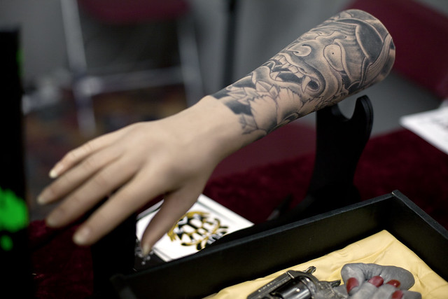 |
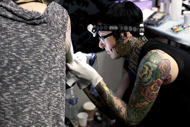
| An unrelated picture of an arm. Just an arm, nothing more. TOP PRIZE NO.1 goes to The King's Cross Tattoo Parlour, in particular Otto D'ambra, whose gallery you can see HERE. It's very much just a style I can get on board with, simple black line drawings but with plenty of detail and shading. A lot of the tattoos that are on show in that gallery remind me of things that I would draw - or rather, would like to be able to draw.    |
above images © www.kingscrosstattooparlour.com/
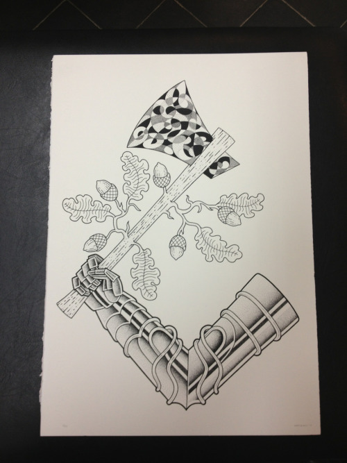
Just...awesome. It looks like the other artists that work there are equally as talented, it's just something about the monochrome tattoos that gets me.


 |
| above images © http://www.mpatshi.be/ |
 |
| I dunno what the hell's in there, but it's weird and pissed off, whatever it is
above images © http://www.beautiful-freak.be/
|
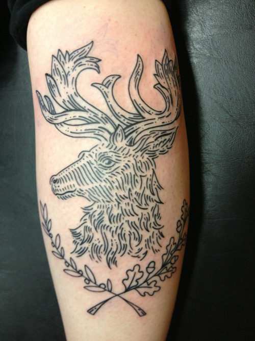
The final artist I'm going to mention is Brighton tattooer Gary Burns (http://garyburnstattoo.com/). More monochrome goodness
  |
| above images © http://garyburnstattoo.com/ |
I don't think I really need to point out that there were hundreds of amazing artists and studios there. These were just a few I picked out because they stuck in my mind while going through the stack of business cards you inevitably collect while walking around.
That just leaves me to fill up the remainder of this post with pictures that I did actually take, rather than ones I should have taken.

 |
| Life cycle of a tattoo (I've unfortunately forgotten which stall this was...) |
And finally, some of my convention companions, taken outside when we were forced into the cold and into the pub by a fire alarm.

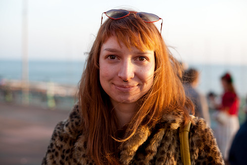
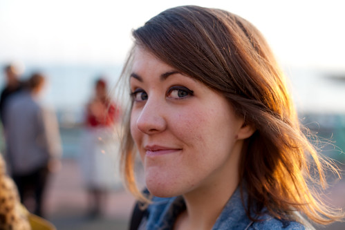
I felt sorry for the people who were mid-tattoo.
No comments:
Post a Comment