Thursday 23 October 2014

Seven Days of Cosplay


As the title suggests, these might not be the most recent photos. But remember; cosplay is forever, not just during events during the month of May.

A few years ago, I visited the MCM Comic Con. Lots of awesome things to buy and awesome things to look at and things and things and things. I went with a friend, had a laugh and took a camera just to take. The photos captured my memory of the day perfectly, but I really felt like I'd missed a trick by not taking a bit more time and care in actually taking the photos.

Evidently I didn't think any of them were worth having as separate images.
For a photographer, going to these conventions is a load of fun (beside the point that I love most of the stuff they have there anyway). The cosplayers dedication to their image and the time you can see that they have put into their costumes is such a draw for me. You really get to see some fantastic, mind blowing creations, and I hadn't felt like I had captured that on my first trip. So when I decided to visit the convention again this year, in May, I also decided that this time was going to be different. Being a lot more confident than I was two or three years ago, I went, camera in hand, boldly annoying people throughout the entire day. Here are some of my favourite shots that I took


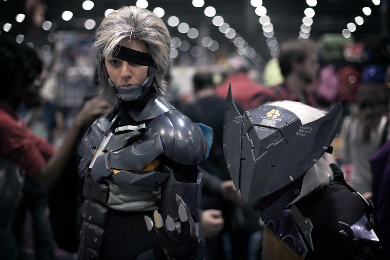
First up we have Raiden and Bladewolf from the wonderful Metal Gear Solid spinoff "Metal Gear Rising: Revengeance." Now before we all get worked up again about that absurdity of the word "Revengeance" (although Blogger's spell check definitely won't let me ignore it), let's just take a moment to think about how fun that game actually is and also how fun this is as a double costume. It's definitely not one I would have thought of myself, and think it's a pretty fantastic idea.


These cordyceps fungus sufferers from "The Last of Us" were doing a great job of stumbling around making noises at passers by. That's dedication.


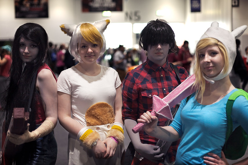
More cosplay teamwork here from some genderswapped Adventure Time characters!


進撃の巨人! There was plenty of Attack on Titan cosplay around, but this Female Titan was one of the best. Especially the eye makeup. Creepy.


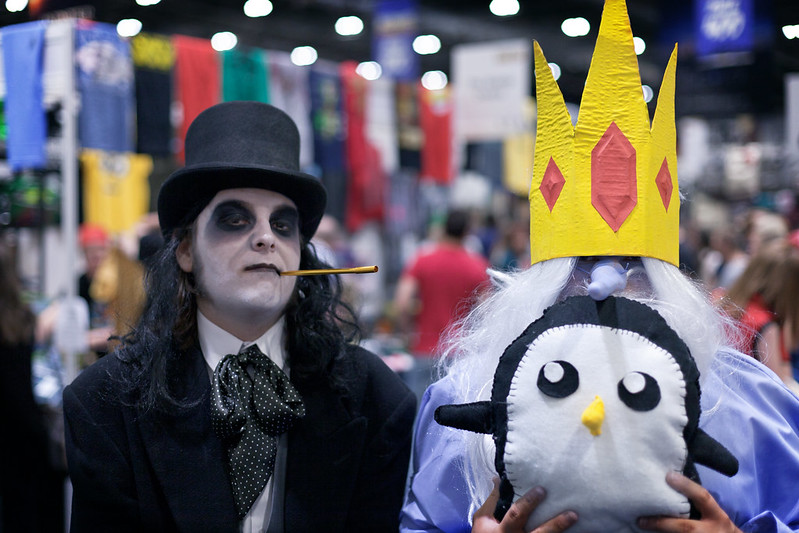
The Ice King and his penguins. Probably one of the more original double costumes that was around at the event!


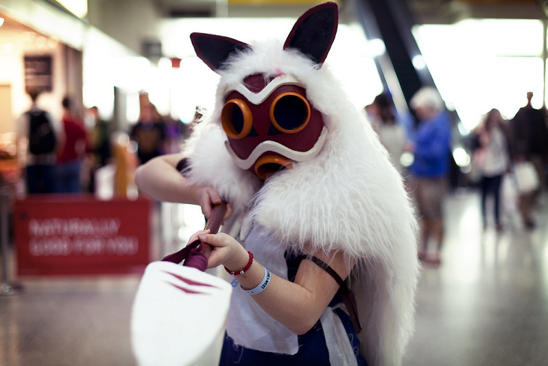
This was by far the best Princess Mononoke that I came across at the event. Definitely the best mask.


Either screaming with pure delight or absolute terror. It's hard to tell sometimes.


No one ever really takes into account the feelings of their Pokemon. Sometimes they just feel a little emotional.


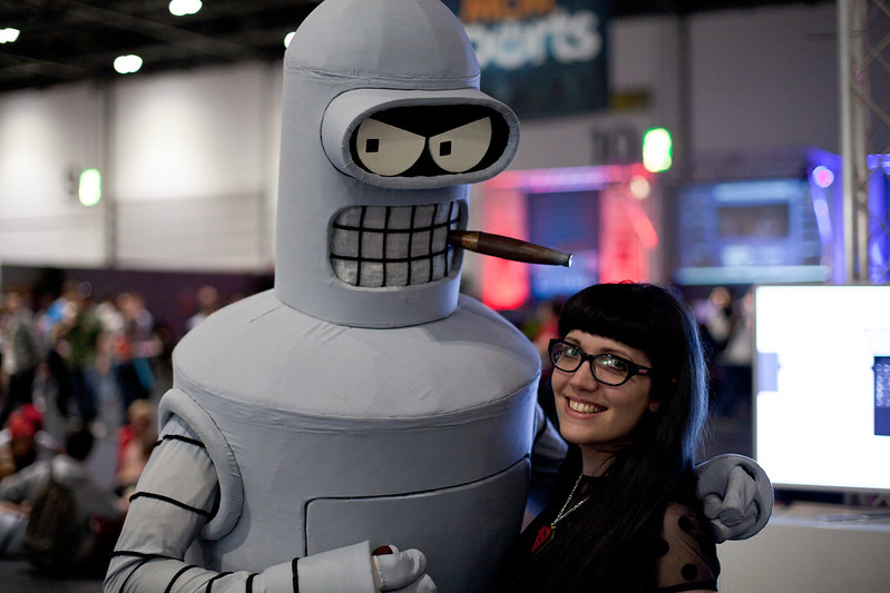
And here to finish is some amazing Futurama cosplay, posed with by my partner in crime!

Such dedication.

So cosplay.

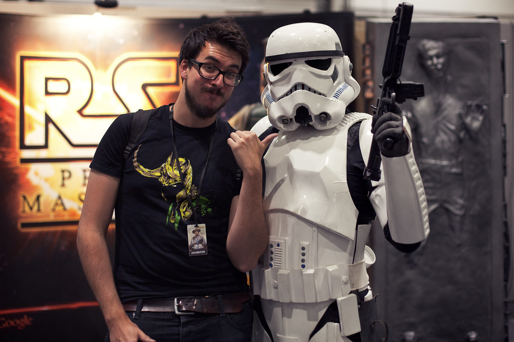
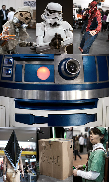
Actually, we can't finish without the classic "Nerd and Storm Trooper" image


I hope everyone going this weekend has fun! No matter how you feel about this convention, you can't deny that it's a whole lot of fun when you do actually go.

Wednesday 9 July 2014

Recent Design Adventures

It's that time again where I create a blog post that is just a collection of images with no real purpose. They're just things that I have done, and may have an explanation or may not. Here goes

About a year ago, I told two students at my place of employment that if they completed a task, I would draw and create a Pikachu-based badge for each of them to wear. I am yet to actually make this into a badge, but I finally drew and scanned my Pikachu (slightly based on a Ditto in Pikachu form). As a small test, I decided to colour it in Photoshop. And there it is. I think he's adorabubble, if in need of a bit more work.

I think this might be my first paid commission for a poster. Designed for someone's wedding anniversary, if I recall correctly. I've never seen Commando, but I'm obviously familiar with the excessive amounts of one-liners, and my friend James messaged me over some screenshots that he felt were iconic moments in the film. So I decided to incorporate as many as possible!

More Pokemon themes here! I designed this for my housemates birthday. She has recently got a Nintendo 3DS and has gone Pokemon crazy. This poster went through a couple of other designs before I decided on this one. Looking at it now, I can see a glaring error on the design of the big pokeball which I may decide to go back and fix. But shhhh, you haven't noticed it so that's all fine. Here, below, was the original design. Slightly simpler with a bit of text.

 
The hardest decision of your teenage life. The day you stopped being a child, and became a pokemon trainer.

Self portrait. Floating head in space. Pretty standard. 'nuff said. Short sentences. Stopping now. Another attempt at digital colouring of a hand drawn/scanned piece. This being the original sketch.


My twitter background. Square pixelly skully cubey goodness, yeah?

 
This was a piece I made for a competition on Talenthouse to design a poster for a band, The Pierces. I kept it quite simple, but my idea was very similar to a number of other entires, as we were supplied with a music video to work from for inspiration. Lots of experimenting with moiré patterns though. I only discovered this terminology a short while ago, but a brief description, from wikipedia, summarises the technique as "
a secondary and visually evident superimposed pattern created, for example, when two identical patterns on a surface are overlaid while displaced or rotated a small amount from one another."

 
That was another little experiment that helped me decide on the style that I wanted to choose for The Pierces poster.


Finally, my most recent "Duke's After Dark" poster for the late night screenings that take place at the Duke of York's and Duke's at Komedia Picturehouse cinemas in Brighton. Managed to slip in one of my photos of Japan in the background there.

Look at all that. Enjoy it. Let me know what you think.

Wednesday 28 May 2014

I don't update because I'm busy, not because I don't care

Hello! Excuses this time for not updating? You've heard them all before!

But actually, for the past few months on and off I have been in the process of helping shoot a short film, which is incredibly exciting! I hope to be able to share it with you soon, and if not then definitely a post with some screenshots and production stills of what I've been up to!

In the meantime, have a barrage of images that I have made for various things since January!

In the wake of the retirement of Hayao Miyazaki, Picturehouse Cinemas, including one of our wonderful Brighton brance, Dukes at Komedia, is putting a season of Miyazaki-directed Ghibli films! Check out your local Picturehouse website to see if they're playing near you! I cannot wait to see Princess Mononoke on the big screen!

Part two of the christmas present I mentioned in the last post! Two down, two to go!

Lost in Translation! What can I say? I enjoyed using the mixed graphic/photography, especially as the image I used was one of mine from Tokyo.

This was a tough poster to design for. There is a lot of stunning imagery in Badlands, but not much that could easily be captured without losing the entire tone of the film. This was my attempt.

A very fun poster to make, especially the red graffiti brush. I may revisit this in the future to sort a few things out.


Pixel art funtime! I was very much inspired by the pixel art of point and clock adventure games from the late 80's/early 90's, especially for the title "WEIRD". Dat shading.

...and that is all! Until we meet again, old website! Farewell!!


Friday 10 January 2014

...and then some.


HAPPY NEW YEAR TO ANYONE WHO READS THIS AT ANY POINT IN THEIR LIFE! I hope you all spent 2013 preparing yourself for 2014, and I hope you spend 2014 being awesome.

Now that's out of the way, we can get down to the all important task of looking at a few things I've designed in the last few months. It's been a while since I updated, so there's a nice little collection. Especially as my last few posts have been photography-exclusive. Time to mix it up!

Chronological order is probably the best, to avoid any anti-climaxes or anything of the sort.


This is probably one of my favourite posters I've done! Toby, who runs the screenings that I do a lot of the posters for, really just said that he wanted something a bit psychadelic and trippy, so I had to try and work that into the way that I like to create things. El Topo is an amazingly visual film that has a lot of strong imagery. Lots of fun things for me to play around with.


The original poster idea was going to have more of a traditional colour scheme, with a blue sky and the such, but I felt that colourising it really added to the more surreal feeling that was wanted.


This was designed for a all-night screening of Season One of The Walking Dead at the Duke's at Komedia cinema in Brighton. The original idea was just to have a dilapidated version of the Palace Pier. I decided I wanted to have some sort of nod to The Walking Dead's origins as a comic, which is why I drew the gross zombie mouth and kept it as a hand drawn image rather than recreate it digitally. I often try to include slightly subtle, hidden or faded imagery in some of my work, and this poster has one of my favourites - the bloody Brighton & Hove council logo just behind the main title. BLOOOOOOD. Also, I'm really not sure why I chose a white border for this. Oh well. It was three months ago. I was young and foolish.


CARRIE! CARRIE! CARRIE! What more can I say? I was really excited about doing this poster, and I pretty much got it exactly how I wanted it. The gradient, the texture. I hate to say it, but I was quite pleased with myself. The only thing that was missing, according to Toby, was "more blood". So more blood there was, added at the top.


I wasn't actually asked to make this poster, but I was going to the screening and I really wanted to have something awesome made on the off chance that I might have been able to get Chuck Pahlaniuk to sign it. I didn't get the opportunity. Sob.


Christmas!!! I had so many half-baked ideas for this poster, but thanks to sitting down with my colleague over lunch, he helped me sort them out and this was the final idea I came up with! I'm not sure if it's obvious enough, but the shape of the city and the underground layer are meant to mimic that of a christmas tree. I actually ended up selling a few copies of this and still have a few left!


I created this as a Christmas present for someone special! It went through a few terrible looking stages before reaching this finished version! It's the first out of four that I am making, based on SEEMINGLY unconnected films, and I shall be posting them up here as I do them!


Space Bear!!! The first of three, the other two being worked on at the moment.I will hopefully have number two up and about soon, I'm currently in the process of finishing the sketching and then it's onto the ink!

Well, THANKS! if you made it to the end of all that. I will soon be setting up a facebook page for my work, where there will be more updates and also an opportunity to buy some excess prints I have from older screenings that I designed posters for. How exciting for you! How exciting for me! We can all be excited!

Off you go now.