
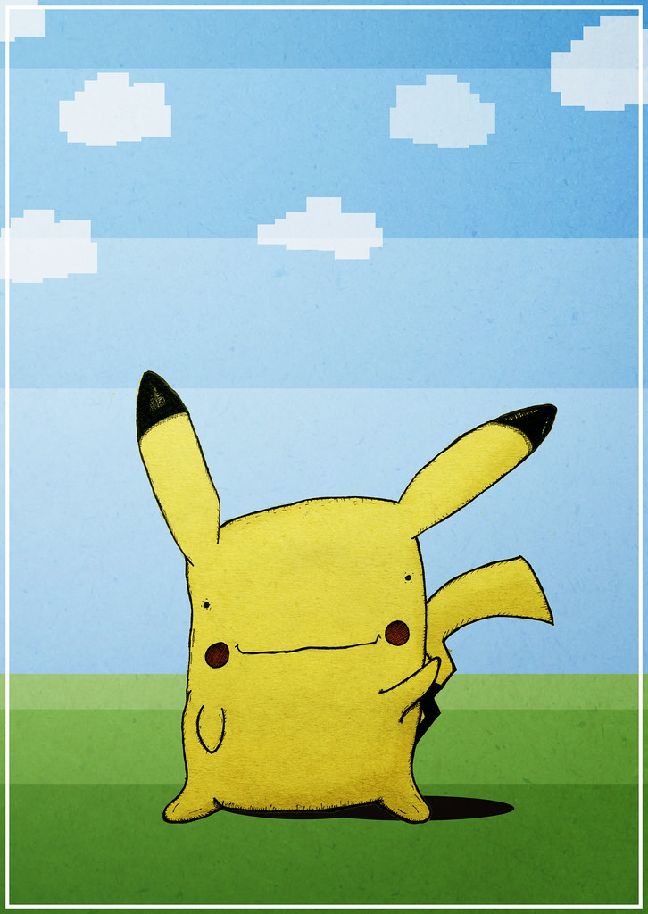
About a year ago, I told two students at my place of employment that if they completed a task, I would draw and create a Pikachu-based badge for each of them to wear. I am yet to actually make this into a badge, but I finally drew and scanned my Pikachu (slightly based on a Ditto in Pikachu form). As a small test, I decided to colour it in Photoshop. And there it is. I think he's adorabubble, if in need of a bit more work.

I think this might be my first paid commission for a poster. Designed for someone's wedding anniversary, if I recall correctly. I've never seen Commando, but I'm obviously familiar with the excessive amounts of one-liners, and my friend James messaged me over some screenshots that he felt were iconic moments in the film. So I decided to incorporate as many as possible!
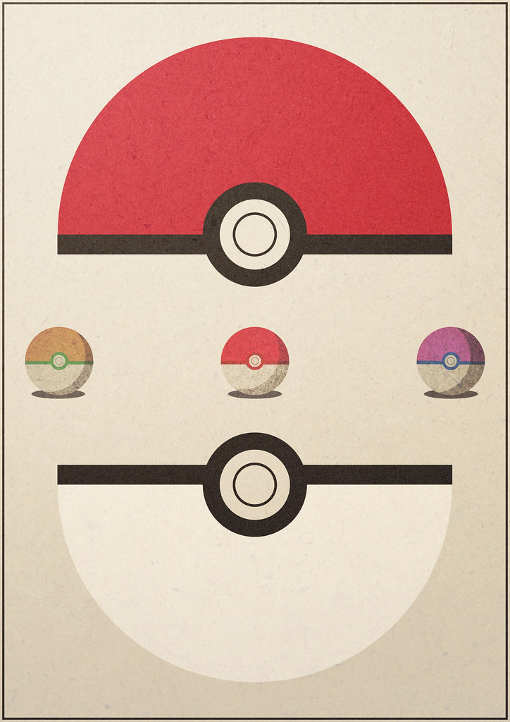
More Pokemon themes here! I designed this for my housemates birthday. She has recently got a Nintendo 3DS and has gone Pokemon crazy. This poster went through a couple of other designs before I decided on this one. Looking at it now, I can see a glaring error on the design of the big pokeball which I may decide to go back and fix. But shhhh, you haven't noticed it so that's all fine. Here, below, was the original design. Slightly simpler with a bit of text.
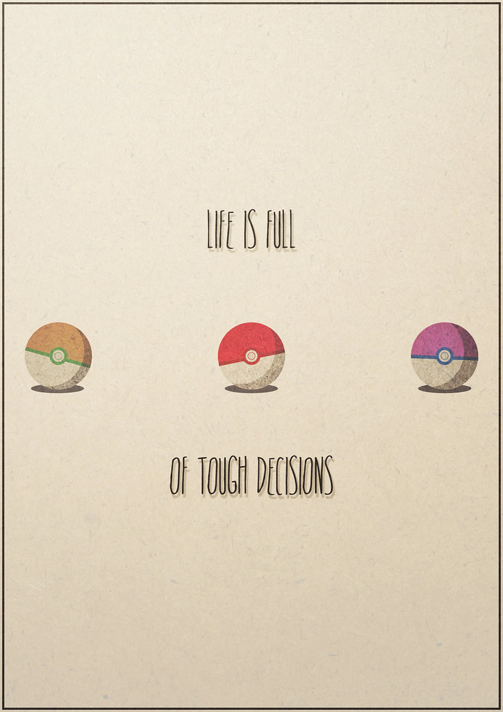
The hardest decision of your teenage life. The day you stopped being a child, and became a pokemon trainer.
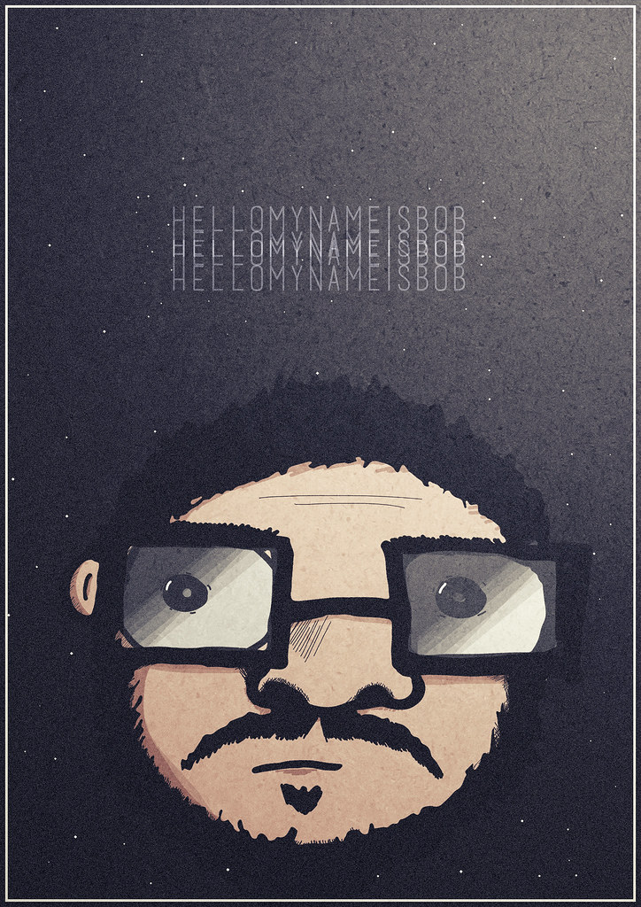
Self portrait. Floating head in space. Pretty standard. 'nuff said. Short sentences. Stopping now. Another attempt at digital colouring of a hand drawn/scanned piece. This being the original sketch.

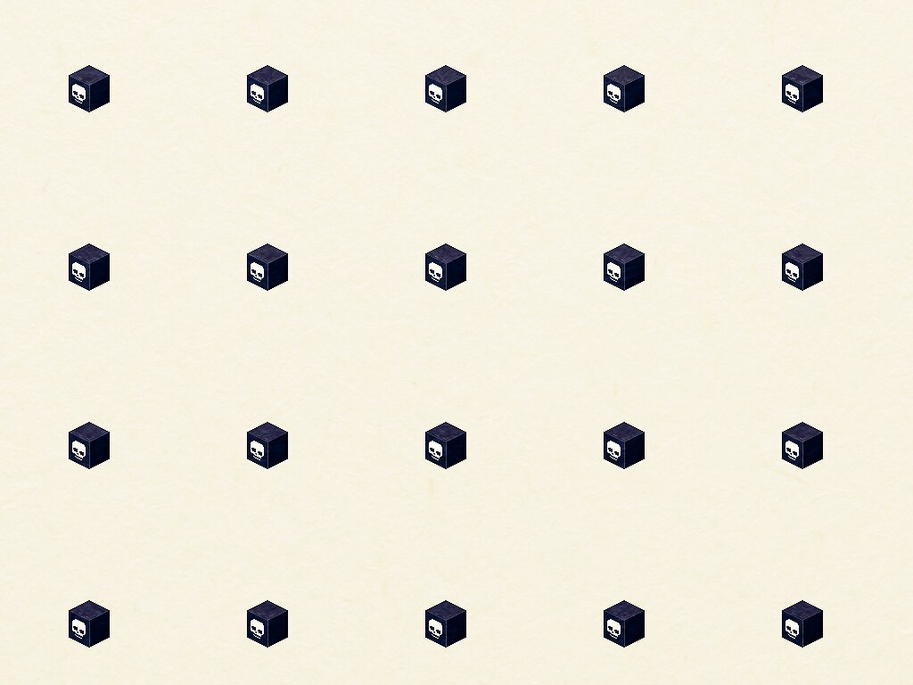
My twitter background. Square pixelly skully cubey goodness, yeah?
a secondary and visually evident superimposed pattern created, for example, when two identical patterns on a surface are overlaid while displaced or rotated a small amount from one another."
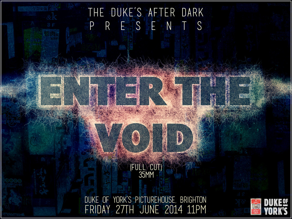
Finally, my most recent "Duke's After Dark" poster for the late night screenings that take place at the Duke of York's and Duke's at Komedia Picturehouse cinemas in Brighton. Managed to slip in one of my photos of Japan in the background there.
Look at all that. Enjoy it. Let me know what you think.
Look at all that. Enjoy it. Let me know what you think.