Friday, 23 August 2013

So Edgar Wright drew a self-portrait for me once...


So I've been drawing. I don't know how you'd go about classifing them, I guess they're somewhere between a vague form of illustration and a doodle. Doodlestration? Another word like "ghostaroid" that I'll forget I ever used.

I've actually been doing a lot more drawing than anything else. Though I still really think of myself as a 'photographer' and that photography is my 'thing', working full time all the time doesn't lend very well to being able to set up and shoot the sort of things that I want to achieve in the studio. Drawing is something I can do when I have a free moment, pretty much wherever I am. The whole process of sketching something, erasing MASSIVE parts of it that I'm not happy with, re-sketching and then inking is totally therapeutic. It's also something I can do while playing video games or watching Buffy.

As a matter of fact, screw my drawings. I'm going to write this post about what I'm playing at the moment - Bioshock Infinite


It's good and I like playing it.

The End.

Ok. So, I don't have much to say on that at the moment. Let's try...


Ok, no. Maybe another day.

Back to whatever it was I was talking about before. As I have updated my gallery with an illustrations section


I thought I'd take this opportunity to post a few of the things I've been drawing to practice my skills. I'm still learning a lot about shading and shadows and what makes a face a face and things like that.

So here we go.

So one thing I've really wanted to improve on is drawing faces. When it comes to photography, I do a lot of portraits. Over time, I just came to realise that most of the images that I was happiest with were of people, and people are fun to work with. So it seems to me that it makes sense that I'm trying to get better at drawing people also. I'm not sure why I've written that like I'm trying to convince myself that's the truth.

So these are some of the most recent drawings I've done. We'll sort of be going reverse chronological, starting with the more recent and heading back through time.


Old acquaintance, but a new friend - Charlie has colourful hair. So I thought I'd take my first step into the world of using colour in my drawings. I snapped open a felt tip pen and dunked it in a glass of water and painted with the furry insides. Came out kinda cool!


I drew this for Fran, who is living in Japan. I took a photo of her a long time ago and thought I'd attempt to make a portrait for her birthday.

Brighton Summertime
Here's the original image, shot on a Lomo LC-A, longer ago than I care to try and remember.


I have titled this "An Illustration of a person who may be, but probably isn't, comic book artist Kate Leth."  Kate Leth is a Canadian webcomic artist...well, that's kind of all I have to say. Immediate cool points awarded based on pure description. But this image is based on a photo from her instagram, but it also looks like it could be Brody Dalle. The fact that I drew something that looked like anybody is pure amazement to me.  But anyway, I've no idea how I came across her website but I have a feeling it might be some sort of Adventure Time or Ryan Pequin related tweet or link on a wiki.

Either way, I like the way she thinks


Go check her stuff out, she resides here, here and here.

So along with people, I decided to draw my second favourite thing. Batman.


The idea behind was this was it was meant to be drawn from a description of someone who had seen Batman attacking someone, presumably a criminal. So it's kind of this creepy, unnatural, deformed shape stooped over someone, questioning them or checking their pulse or I don't know. That's why there's a pair of legs just coming out of nowhere.

Now here's a little look into how I design some of my posters for the Duke of York's cinema. I've also done this sort of comparison before with my poster for the Korean monster movie 'The Host', but this ones more directly related to drawings and sketches.


Now we're getting into dangerous doodle territory. I think I've included a few of these in my post when I started this website about a few of the things I'd drawn and what artists inspired me. But now they're scanned in nicely! I'll give a brief description of each!


I saw a incredibly interesting documentary recently called Blackfish, which explores the history and treatment of killer whales in captivity. Whether you like it as a documentary or not, it really is an emotional piece of film and I would recommend it to anyone with an interest in animals. I drew this with help from my rather cool drawing nib, nib holder and pot of ink, bough from Pen to Paper in Brighton. They're an amazing shop of notebooks and drawing supplies!!


I couldn't even  begin to start to explain why I drew this.


Slightly Twin Peaks inspired cup of coffee.


Drawn after a really good christmas. I think I felt I had to draw something depressing to balance it out.


I felt it totally necessary to sign and date this doodle, so it must have had some importance? Can anyone tell me what the importance is?


This is the facical expression of a man who wakes up one morning, looks in the bathroom mirror and sees that he has started to grow tentacles. On his face.


Everyone's favourite Jhonen Vasquez created robot dog G.I.R reimagined as a cat. Pure genius if I do say so myself. This is the oldest thing I've included in this post, this must have been from about 2007.

So that's a nice little collection of things that I've drawn. Now for an image of something someone else has drawn for me.

The year was 2010. The month was December. I had decided that Scott Pilgrim was one of the best films I had ever seen and GOD why couldn't more films be made with that much attention to detail in every tiny little aspect of it - but yes it was 2010, for sure. Edgar Wright was doing a signing at Forbidden Planet in London, and me being the awkward gentle boy that I am, decided it would be a good idea to not just get him to sign my Scott Pilgrim DVD.

Just for the record, I have a bad history of awkwardly getting famous people to sign things. I once asked Amanda Palmer if I could take her photo with my polaroid camera, and then she insisted on me hanging around so we could do more. Like, a polaroid of her holding a polaroid of her holding a polaroid. WHICH WAS GREAT. Like, actually pretty awesome. I think I probably felt it was really awkward at the time though.

A much younger, beardless me with AFP
I also got Kathryn Isabelle, the star of Ginger Snaps and American Mary, to sign my "Grubbs Burgers" travel pass holder. Anyone who lives in Brighton knows how good a Grubbs Burger is, and now I have told Kathryn Isabelle and the Soska Sisters of this fact also. Go me.

ANYWAY, I asked Mr. Wright if he could draw a little self portrait of himself for me. And he did. And here it is, on the internet proper for the first time.

A Handsome Chap
Truly a thing of beauty. You can thank me and Edgar later for bringing this to you.

WELL THAT'S ALL FOR TODAY. Oh, except I did this


My t-shirt collection is so large that I decided to document a month of wearing different t-shirts. Damn, I'm interesting.

So now that's all for today. I hope you have a bloody lovely weekend.

Friday, 9 August 2013

Craftiness

The award for hardest to read title ever goes to...
HELLO. So it has literally taken me over a month to finish off writing this post, just because there have been so many things I've been trying to do! But here we are. Welcome. Let's get started


I feel like this every single time I finish a blog post
Crafts. I've been trying to figure out how to start this post by standing at a train station platform and saying the word "crafts" to myself in a variety of different accents. It hasn't really helped me in anyway apart from to at least make it look like to the casual skim reader of my blog that I may have written, or attempted, some form of introduction.

Are we done with that? Yeah? Yeah. Good. 


So, I wanted to write a post about crafts, like, arts n' crafts, but more specifically about some of the lovely people I have met in the last few months who have just blown me away with their megaskillz and awesome products. Brighton is a great place to be if you have a creative idea, and want to be surrounded by helpful, friendly creative people who can offer you bucket loads of advice and support. This has been highlighted especially well in the last month by the Brighton Etsy Team, who have recently been running "Mentor Month", in which some of the extremely talented members of the team, who have had experience in running their online brands for a while, offer help and advice to the less experienced members. A true collective thing of beauty.


Anyway, a bit of context to why I've had the opportunity to meet so many lovely folks, then. If you've read my blog, looked at my Flickr or talked to me in the last two years, you probably know that I am a friend of a girl named Karli who, along with her man friend Jacques, run Designosaur, an awesome jewellery designer. We've known each other since univeristy, where I studied Photography and she studied Product Design.

I'm sure you can already see the links forming in this story.


So since her final year project, and pretty much since the creation of Designosaur, I have just sort of hung around and helped her with any bits and pieces she's needed photography wise. Over the years, she has been a very helpful photography assistant to me since we first met and started hanging out. So our ratio of helping each other has somewhere probably evened itself out along the way.


Read about Karli and see a lot of photos I've taken of her over the years here -
http://uniqueandchic.co.uk/geek-thursday/2951/

Through just visiting her at craft fairs and events that she's helped organise, I finally started to be able to put some faces to names I'd seen online quite a lot and also names to faces of people that I recognise from visiting craft fairs around Brighton for the last five years. So I'ma write a little bit about some of these delightful folks, and force their etsy, twitter and facebook links down your throat so you buy their things. 

helloDODO
http://hello-dodo.blogspot.co.uk/
http://www.etsy.com/shop/helloDODOshop
https://twitter.com/hellohelloDODO

I feel that helloDODO make things that pretty much summarise what a lot of people like about Brighton. And by that, I don't mean that what they sell has actually anything to do with Brighton itself (though a few designs do, of course!) What I mean is that their designs are bright, colourful, cute, cheerful and funny. AND INFUSED WITH ANIMAL RELATED WORDPLAY (ok, maybe you can't describe Brighton with that last one. I wish you could). There is so much pun, honestly, it's just wonderful
Party Animal
Bear With Me
Hello Hello Dodo
The Quick...
Lovingly screen printed, you can get prints, tote bags, t-shirts, badges (who doesn't love a good badge?). I currently have two of their prints hung on my wall!

Caleigh-Ill Art
http://www.caleigh-ill.com/
http://www.etsy.com/uk/people/caleighill 
https://twitter.com/caleigh_ill 
https://www.facebook.com/caleighill.art
They all have great names. I'm saying this because I think one was called Bob. No relation.

The illustrations of Caleigh Illerbrun are definitely my favourite things at the moment. Possibly one of my favourite things that I've found this year. Often focussing on animals of the woodland or forest variety, they tread the line of dark and slightly creepy yet insanely cute at the same time, and that is a fine line to tread. Her series of "naked owls" illustrations and hand painted owl-Russian-dolls hit both of those boxes perfectly, and reminds me a little of soem of the reasons I mentioned for loving some of the artists I mentioned in THIS post about drawing and illustration (re-reading it, it's not a very in depth post. But WHEN DO I EVER WRITE IN DEPTH POSTS? Never, right?)

I also love these paintings that she has created, so much that I bought three prints which I have just hung on my walls! They're printed on a wonderful kind of cloth that really adds some amazing texture to the images. How exiting... but anyway, each image has such curious potential to an amazing story behind them - what are these creatures? Why are they where they are? What other things inhabit these strange landscapes. I want to know. Immediately. 

Comes in A3 and A4 prints, phone cases, stickers, tote bags, russian dolls. Funnily enough, I found that I actually have one of Caleigh's stickers on the back of my acoustic guitar that I must have put on there about a year or two ago from a craft fair!

ilikecats
http://www.i-like-cats.co.uk 
https://twitter.com/tobyoliverdean
http://www.etsy.com/uk/shop/ilikeCATSshop

Cats. What could ever be more appealing as a gift for a loved one or for yourself than cat related goodness. And you wouldn't want to buy cat related things from someone that didn't love, or at least like, cats. AND THAT IS WHERE TOBY COMES IN, with his brand name and URL proudly declaring his love of felines. Lovely simple, joyful illustrations of cats, I have bought things from him on more than one occasion for my cat-loving mother. I actually just sent her a card in the post. THAT COULD BE YOU SENDING CAT-CARDS IN THE POST.

I really need to rein in the use of these capital letters.

Mooshpie
http://www.mooshpie.co.uk/
https://twitter.com/mooshpie
http://www.etsy.com/people/mooshpie
https://www.facebook.com/Mooshpie
Lost Girls

Mooshpie! MOOOOOSH! Such a great word. And such a great style to match it also. Simple and cheerful but at the same time managing to hit being strangely nostalgic right on the head. I feel like a lot of Cheskas work would have fit right in on my bedroom wall when I was younger. She also has a shed-studio, which I think is just the best thing ever.
Bear
Fox


Kate Rowland
http://katerowland.co.uk
http://www.etsy.com/people/kateslittlestore 
https://twitter.com/helloiamkate


I only discovered Kate Rowland at a craft fair in Brighton a few weeks ago, and I have decided this - If there's not at least one badge or necklace in this array of fantastically designed pop-culture references that makes you go "I MUST HAVE IT, TAKE MY MONEY", then you and I are probably not going to get along, and you should leave now and educate yourself. And then return and buy some things. Twin Peaks, Game of Thrones and Arrested Development. AND SPACY THINGS. All the best things. She's also got some totally rad illustrations and paitings on her website. Yes, rad. What? WHAT'S WRONG WITH THE SERIOUS USE OF THE WORD RAD?

Award to worst formatting of a blog post ever goes to me. I truly have accomplished something today.


I also made this video at the Brighton Etsy Craft Party. It's got some lovely music on it


Good memories of a fun evening...

Friday, 21 June 2013

Nostaliga a.k.a The Vampyre of Time and Memory


About two months ago, I was asked by a wonderful friend from my university course, Steph Singer, if I would like to take part in an exhibition evening that she was organising. Run by a company called BitterSuite (www.facebook.com/BitterSuiteUK & www.bittersuite.org.uk/) who are carrying out events to research the influence of music on different senses and creative processes and the such. From their website -

What happens when you see red colours whilst listening to romantic music? Or if you eat sweet foods whilst listening to joyful music?... Can one sense enhance the experience of the other - and how?


They mostly work with classical music, but it was in May that they decided to curate an evening of artwork inspired by a piece of dance music from the 90's, specifically this track.


Steph asked if I'd like to exhibit some photography for the evening, and if I could document my creative process to help contextualise the work in the theme of the evening.

So I did. And this is it. 

"I was excited and a bit taken back when I opened up the youtube file that contained tonight’s music, because I actually loved this song when I was younger and had forgotten about it completely. It brought to me some very distinct memories. Memories of when, I can only assume, the song was released, which must have been around about the mid to late nineties. I would have been aged somewhere between 7-11. I’m now 24 and nearly 25, so my general recall of that period of my life is a little hazy to say the least, so I was fascinated that this song brought so much back to me so quickly.

It conjured up images in my mind of being driven back home in the early evening after a long day out in the nearest town to our village, or from a relative or friends house. Just about the right time of the evening when the local radio station would be starting to play their saturday-night-out preperation music. Not a fascinating image for most, but an extreme time-warp for me. It was this resounding nostalgic image that I looked towards for inspiration. An image that represented my own personal memories towards this music.

“EASY”, I thought to myself, but tried and tried as I could, I couldn’t sketch out an image that was strong enough to represent this specific distant nostalgic memory.

Which is when it dawned on me that it wasn’t a specific memory I should be trying to encapsulate in this image. I had made that trip to and from town in the passenger seat of my mother’s car hundreds of times.
This wasn’t about the actual trip in the car or the actual times I heard the song on the radio.
It was about the fact that this one song had brought this extremely specific yet at the same time non-specific distant memory to the forefront of my mind. I wanted to create an image that captured that intense distant feeling of nostalgia, not that actual specific nostalgic memory that I’d had.

I, as I’m sure everyone does (and if you don’t, you’re lying), occasionally suffer from severe nostalgia-attacks. Crippling thoughts that transport you back to another time, for better or for worse. Something as simple as a look on someone’s face, the smell of perfume, the colour of someone’s hair, a full moon in the sky, a red coat. Perfectly coincidental, random acts of chance that have that specific meaning to you and no one else.

It reminds me of a quote from a book or a film or song or SOMETHING because I can’t remember what. The author or whoever is referring to a woman who has just walked into a room, and states that “She carelessly wore her perfume.”
That is heavily badly paraphrased as I can find no reference of this quote on the internet and it’s probably from something ridiculous. ANYWAY I always read this with emphasis on her. “She carelessly wore ‘her’ perfume”. As if this new woman was wearing a perfume that reminded the speaker of another woman, an old flame perhaps. “Her”. 

That might not be what was intended but I feel it sums up what I wanted to create perfectly.

The image needed to be something simple, slightly haunting and ethereal but by no means sad. We tried a few test shots with no movement and no light on her face, but the results came out looking slightly creepy, something out of a japanese horror film, but in vivid technicolour rather than in dirty monochrome. By using just one flash head as a spotlight and adding that small bit of movement, we managed to create so many interesting and curious forms and shapes, but it was this image where the light has just caught her face that added that extra element the image needed. The colour of the hair, the look of pure contentedness. All things that you could see on anyone in the street that would still ruin your brain for a split second because you saw that same look on ‘her’ face all those years ago.

In retrospect, this image ended up being nowhere near what I had originally thought it would be. And I like it even more because of that, because that is how the world works.
"


The final image.
I unfortunately couldn't attend the evening so poor Steph had to read this out on my behalf. She said it went down well, which is more than I could ask for really so yay.

Here are a handful of other images from the shoot. Words can't really describe how appreciative I am of my excellent friend Elisha for being so damn helpful and patient with me all the time. With pretty much anything I've ever asked her to give me a hand with. How much helpful is she? Too much helpful. That's how I'd describe her, in my terrible terrible words. This shoot was incredibly fun, I came out feeling really happy about the whole thing, and it was great to be playing around with one light to such a creative effect. And a seagull landed on my head at some point of the day, so it was a memorable day all round.


And then the twirling stopped.

I also used this shoot as the source material to create some artwork for the Kent-based band One Day Elliott. It's for a specific song on their new album, and it looked like this.

One Day Elliott - This Thing of Darkness

 So yeah. Buy that when that happens. Nice one.

Friday, 14 June 2013

...and then there were more posters.


Hello internet. Regular website updates re-begin now.

Just typing that is tempting fate. The ironic thing is that I've been so busy doing creative type things that I don't have the time to type it all up. So I'll tell you a little story that made me happy.

Before I went away on my trip abroad that was slightly accounted in my last post (of which there are actually photos to come...sometime), I took a late night trip to the Duke of York's cinema to pick up one of my posters that had been used to advertise one of their screenings. It was David Cronenburg's "The Fly", which was a touchy subject. Mainly because I had this idea for a design that I thought would look really damn cool, and I don't think I really achieved what I had set out to do. Which is a major issue for me.

A quote from Saul Bass - I'm afraid I don't know who created this graphic though
 This quote kind of summarises my feelings towards the whole creative process. Of course, I love it when people DO care about my work, photography or graphics or whatever, but if I'm not happy with it then I can't appreciate that other people might like it. I don't think that's special to me, I think every single person I know who puts themselves out there with their creative endeavours, painting, music, filmaking, has the same feeling.

Which brings me onto The Fly poster.

HELP ME! HEEEELLLPPP MEEEEEEEEEE!
The font is meh, the placement is meh.

And really, I was worried that the design looked like a penis instead of a fly's proboscis.. Of course, if you've seen The Fly you know it's all to do with body horror and reproduction and the such, so ACTUALLY, as Toby from the Duke's pointed out to me, it fits it quite well with the themes of the film. But it's not what I wanted it to look like. And it was made aware to me by a lot of people, in real life and on the internet, that it didn't look like what I wanted it to.

Anyway, I sidetracked myself.

I went to go and pick up this poster, spoke to a few people there and left. As I was leaving, one of the lovely staff members said "nice poster." And obviously, because I'm me, I was all like "HUH? PARDON?" and went over to him. He said it again, I said thanks and launched into a brief summary of what I didn't like about it, because that's obviously what you do when someone compliments your work.

He then replied that it was "obviously a proboscis" and that he was "a big fan" of my work. This is hands down one of the nicest things a stranger has probably ever said about my work, ever. And it made me so very happy. And that's the end of that story.

And now, here are some more pretty things I have made for the cinema recently.

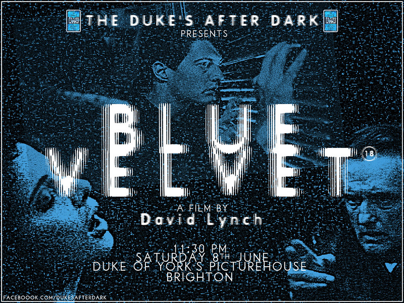
She Wore Blue Velvet
Take my love, take my land, take me where I cannot stand

These two prints were the first prints I've ever made extra copies of to sell, which hopefully might become a regular thing at the Duke's screenings. I sold about half of what I printed up, which was amazingly better than I had ever conceived of happening. So thanks to anyone reading this that bought one, and to anyone who gave me their e-mail addresses about getting larger copies of the Serenity poster, I am currently doing some research on it and will get back to you soon.

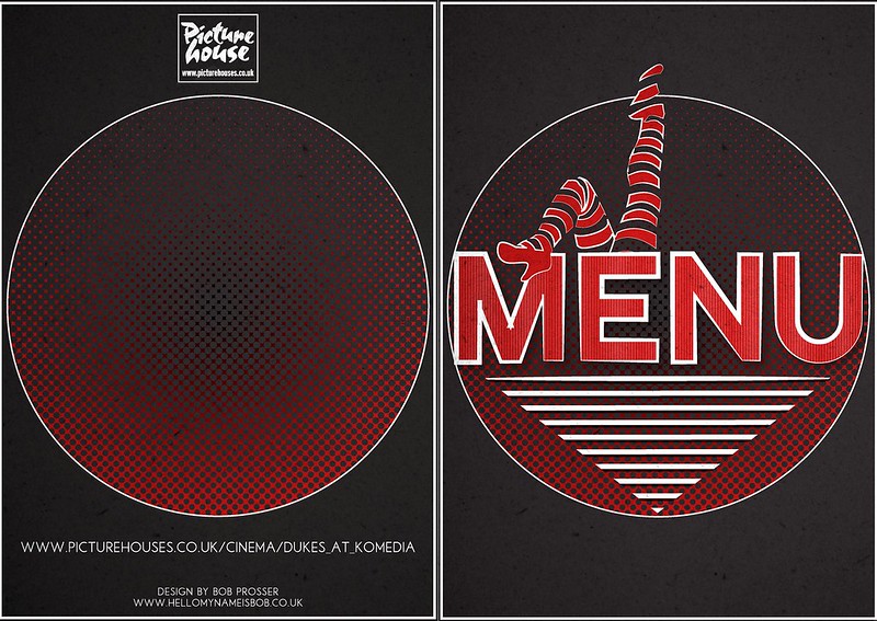
Tasty noms?
This is a menu cover I designed for the Duke's at Komedia, where they serve some damn tasty food. The menu makes it tastier, I believe.

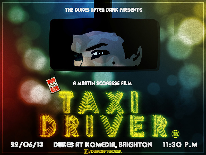
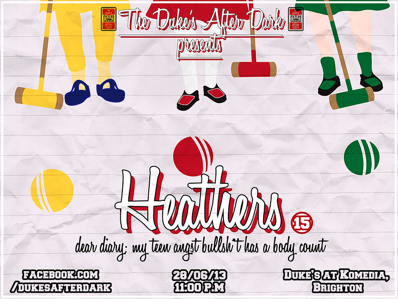
These next two are for upcoming screenings at the Duke's at Komedia, y'all should go because again, it's a fine choice of late night films.

Thank God for the rain which has helped wash away the garbage and trash off the sidewalks
What is your damage, Heather?
I had a really good time making these final posters actually, in research and in process. Mainly Heathers though, as the research involved a lot of drinking and good times.

To round off yet another post of LOOK AT ME LOOK AT WHAT I'VE BEEN DOINGness, I have made my first venture into creating title sequence animations. I have made animations before using more traditional frame by frame programs like Flash, but this was made with After Effects and was beyond fun to actually do, "fun" being a word I don't often attribute to Flash.

It's Firefly related, so it's already awesome from the get go.


Mine is an evil laugh.

Speak soon. Much love. xx


Friday, 24 May 2013

Instant Italy


This is going to be a terribly English post. Not that it's going to be written in terrible english, but I guess because it's essentially about the weather.

What a terrible way to start a post...

As you may have, or may have probably not, noticed in my last post, I mentioned that I was writing at an airport, that being the reason why the post was so rushed and vague about everything ever. Not that it made a change to my normal terrible writing style.

Conversationally sporadic is how I'd probably describe it. My writing style.

But, anyway I went away for a week visting some lovely hot sunshine filled locations around the Mediterranean. Now I'm back in England and it's wet and damp and I have got a cough and bleurgh.

So I was mostly in Italy, also Spain and Causica. I took it as a good opportunity to bust out one of my favourite things I bought on my last trip which was my fujifilm instax. It's white and neat and cute.

Just look at it!
Juggle 'dem oranges.


It takes photos that look like this

OH!! Japan.

I made this one larger because I know she'd appreciate it. Hana's a big John Carter fan, you see.


They're tiny and wonderful and full of good times.

I decided to use the camera to focus on capturing the shapes and colours that flood your vision when you're in that part of the world. Blues, yellows, whites, greens. Everything is so vivid and just seems to shine. These were pretty much shot on the first two days, as my eyes were adjusting to the colour explosions.

Funnel
Open Sea


Mount Vesuvius

Wonky Lifeboat


An Italian Tree of sorts

In The Shadow of Vesuvius


An Island in Early Morning Mist

Such wonderful colours! It was a real treat getting to go around like this. We visited Rome briefly also, but the weather failed me on this day. So I tried to recreate the same sort of framing and everything with the Rome architecture, and actually the colours of the buildings work quite well with the drab skies. The darker shot of the Vatican was taken at early evening instead of mid-afternoon, thus the AWESOME blueish clouds.


There's probably a very fine line between doing travel photography and just wanting to show the internet your holiday photos. Especially in this format. The instant image is such a traditionally vintage way to show people instant moments from places you've visited, people you've met. I wanted to try and capture some moments that were a bit more timeless, rather than the way I'd been using the camera, to shoot people at parties and events.

I did however take some digital images on this trip, so hopefully one day they will grace the digital shine of the internet. It involves a photo of a dog in sunglasses. That's probably about as much as I'll ever be able to offer the world.