HAPPY NEW YEAR TO ANYONE WHO READS THIS AT ANY POINT IN THEIR LIFE! I hope you all spent 2013 preparing yourself for 2014, and I hope you spend 2014 being awesome.
Now that's out of the way, we can get down to the all important task of looking at a few things I've designed in the last few months. It's been a while since I updated, so there's a nice little collection. Especially as my last few posts have been photography-exclusive. Time to mix it up!
Chronological order is probably the best, to avoid any anti-climaxes or anything of the sort.

This is probably one of my favourite posters I've done! Toby, who runs the screenings that I do a lot of the posters for, really just said that he wanted something a bit psychadelic and trippy, so I had to try and work that into the way that I like to create things. El Topo is an amazingly visual film that has a lot of strong imagery. Lots of fun things for me to play around with.
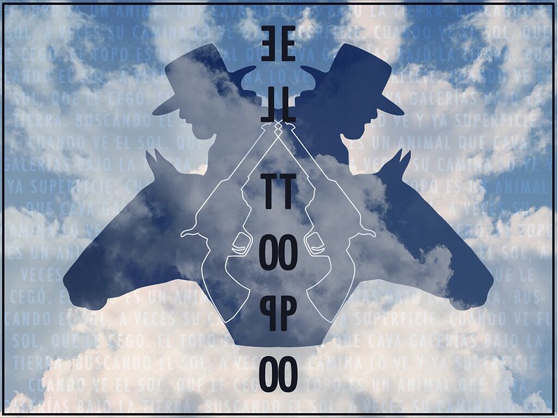
The original poster idea was going to have more of a traditional colour scheme, with a blue sky and the such, but I felt that colourising it really added to the more surreal feeling that was wanted.

This was designed for a all-night screening of Season One of The Walking Dead at the Duke's at Komedia cinema in Brighton. The original idea was just to have a dilapidated version of the Palace Pier. I decided I wanted to have some sort of nod to The Walking Dead's origins as a comic, which is why I drew the gross zombie mouth and kept it as a hand drawn image rather than recreate it digitally. I often try to include slightly subtle, hidden or faded imagery in some of my work, and this poster has one of my favourites - the bloody Brighton & Hove council logo just behind the main title. BLOOOOOOD. Also, I'm really not sure why I chose a white border for this. Oh well. It was three months ago. I was young and foolish.

CARRIE! CARRIE! CARRIE! What more can I say? I was really excited about doing this poster, and I pretty much got it exactly how I wanted it. The gradient, the texture. I hate to say it, but I was quite pleased with myself. The only thing that was missing, according to Toby, was "more blood". So more blood there was, added at the top.
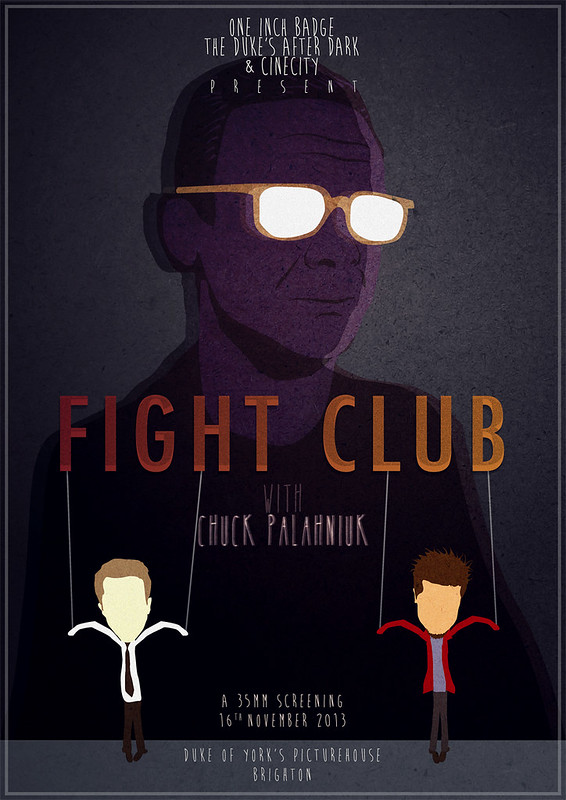
I wasn't actually asked to make this poster, but I was going to the screening and I really wanted to have something awesome made on the off chance that I might have been able to get Chuck Pahlaniuk to sign it. I didn't get the opportunity. Sob.
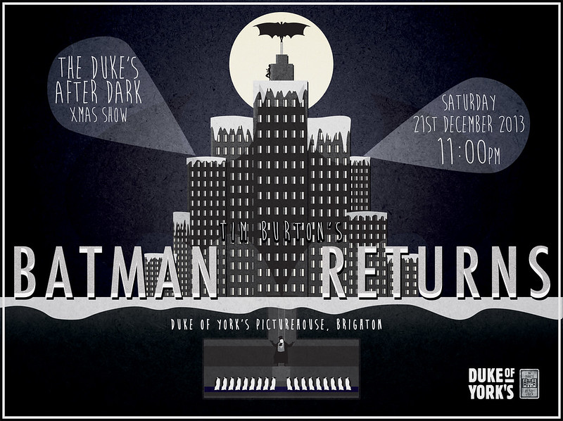
Christmas!!! I had so many half-baked ideas for this poster, but thanks to sitting down with my colleague over lunch, he helped me sort them out and this was the final idea I came up with! I'm not sure if it's obvious enough, but the shape of the city and the underground layer are meant to mimic that of a christmas tree. I actually ended up selling a few copies of this and still have a few left!
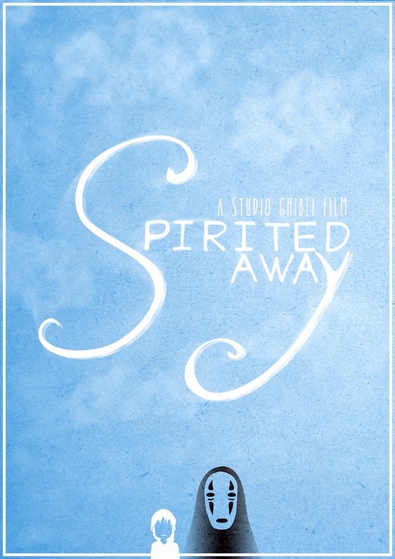
I created this as a Christmas present for someone special! It went through a few terrible looking stages before reaching this finished version! It's the first out of four that I am making, based on SEEMINGLY unconnected films, and I shall be posting them up here as I do them!

Space Bear!!! The first of three, the other two being worked on at the moment.I will hopefully have number two up and about soon, I'm currently in the process of finishing the sketching and then it's onto the ink!
Well, THANKS! if you made it to the end of all that. I will soon be setting up a facebook page for my work, where there will be more updates and also an opportunity to buy some excess prints I have from older screenings that I designed posters for. How exciting for you! How exciting for me! We can all be excited!
Off you go now.