|
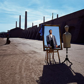
| I'm well aware this image isn't of something on a computer |
This is how this normally goes.
- Make a big cup of coffee
- Sit down to write blog post
- Drink coffee
- Get distracted by MANY things.
Oh Bob, you've done it again.
So let's try again.
I don't know if anyone remembers summer from last year, but I remember it being pretty nice. I remember wearing shorts, I remember lots of greens and blues. I also remember being at work and having to be inside all day. Working at a university during the summer is an interesting experience, mainly as the number of students drops by about 90%. In between my summer tasks and on my lunch breaks, I would find myself browsing tumblr, youtube, fffound and various other websites, trying to suck in and surround myself with as much creative material as possible to inspire me. Amidst all the images I was normally interested in, these websites properly introduced me to the work of an amazing wave of illustrators and graphic designers that were all outputting these fucking fantastic, powerful, creative images from popular culture, brought into a graphic poster form, be it classic films or anime or work based on albums. I'd been saving images like this onto my computer for years, images such as minimalist posters for my favourite movies, so I could use them as wallpapers for my shiny screen, but it was only now that I kind of realised all these artists had websites that were pretty easy to find and look at their portfolios. Sounds stupid when you write it down like that.
I was sort of at a stage where I felt I'd spent my gap year, three years of university and a year and a half of work experience after that trying to improve my photography, and not feeling like I'd got that far with it. I wanted to try something new. Something that was new to me. And designing posters for my favourite movies seemed like a fun way to start.
But people study graphic design and illustration. People do entire degrees in it. I had not. I was just a 'photographer' with access to photoshop, illustrator and a keen interest in creative design who just wanted to join in with all the fun. It was around the time The Dark Knight Rises was coming out so there was an influx of awesome imagery coming from artists like (dare I say it as it is so painfully obvious to mention his name) Olly Moss, and even the IMAX midnight release poster was friggin' amazing.
 |
| 'nuff said (I'm afraid I don't know the artist for this) |
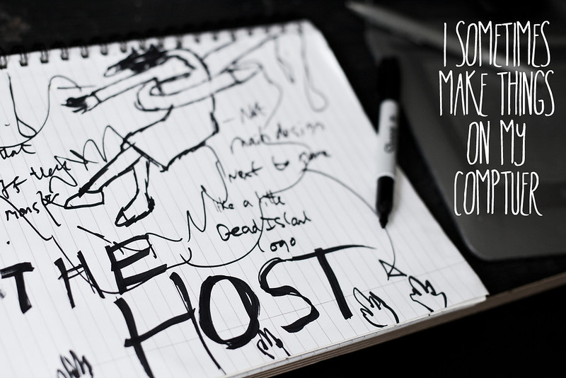
So after doodling a million ideas down, I set to work to teach myself the more graphical side of Photoshop, built upon what I had already learned after years of using Photoshop just for photo editing. Using the text tool and all its character functions, layering textures and the pen tool, these were all things I had a vague idea of how to use but had never needed to use for my photography. And here were the results.
 |
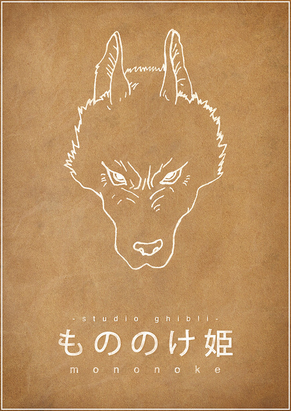
| Princess Mononoke |
This was my first attempt, and for some reason, it was one of the longest things I have ever deliberated over. Which is strange, after now realising how relatively simple it is in comparison to some of the others I have attempted. It started off just as having a wolf's outline on a black background. So I hand drew the wolf, scanned it into photoshop and it somehow morphed into more of a 'wanted' style poster, which I kind of imagined might be up around 'Iron Town' in the actual film. This was more of an experiment in textured backgrounds and also the actual blending of the text into the image.
 |
| The Girl Who Leapt Through Time |
Here was the first design where I actively tried to incorporate all of the thoughts and feelings I had about the film into it, which were clouds, blue skies, and some sort of graph to represent the high-school themes of the film. This was my first attempt at creating my own brush also, which I used to create the disintegrate/jumping through time effect on the graph. And also first proper use of the pen tool for the actual graph. MEMORIES.
 |
| A thief of biblical proportions |
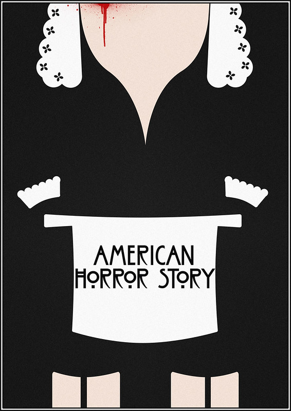
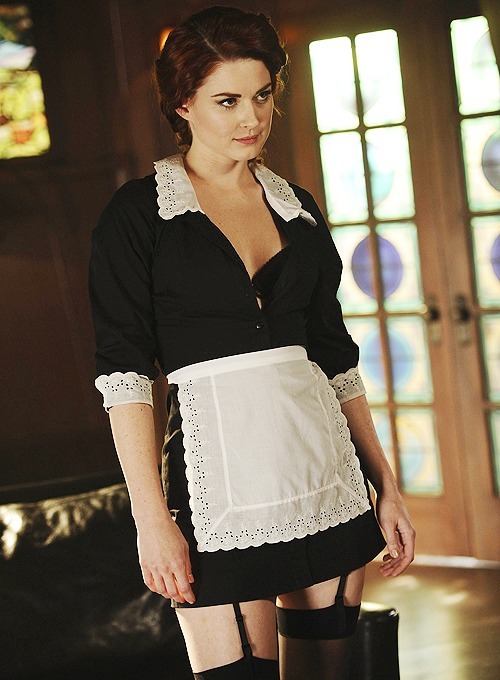
I was also watching the first season of American Horror Story at the time. Just had this idea one afternoon after watching an episode, as the character of Moira O'Hara in her maid outfit seemed to be pretty iconic. And taking something iconic and breaking it down into a much more simplified but still just as bold version is something really fun.
It has nothing to do with the fact that the actress is beautiful...
 |
| MOVING SWIFTLY ON... |
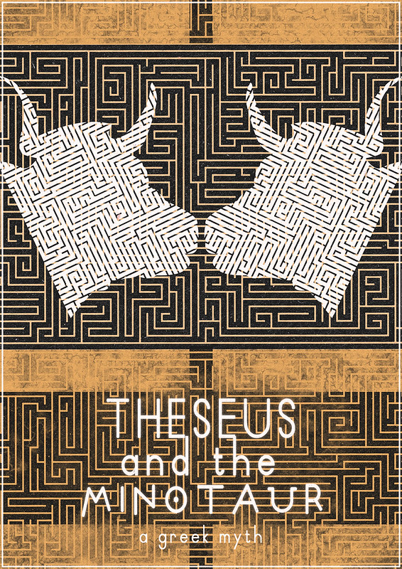
I wanted to try out something that didn't have quite so much visual background to go on, so I attempted to create a poster for the greek myth Theseus and The Minotaur.
It makes my eyes hurt looking at it for too long.
After I'd done these, I sort of lost steam a little bit, term was due to start up again with the students coming back and everything. I think I was applying for another part time job and everything was a bit up in the air. I felt I had learnt a minor skill that might come in handy one day, and I was relatively satisfied.
Soon enough, I saw a post on facebook from the
Duke of York's Picturehouse in Brighton, saying that they were looking for someone to design a poster for the Jim Henson film
Labyrinth, for a late night screening they were putting on under the
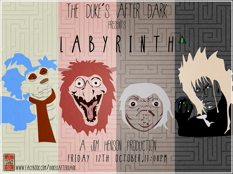
Duke's After Dark header, organised and programmed by Toby King, one of the loveliest chaps I have met around Brighton. What with Labyrinth being hands-down one of my favourite films ever, I jumped at the opportunity to have a go at designing something. For some reason or whatever, I think I had been missed out of the initial e-mail brief, so only had a week to come up with an idea. So I chose what I thought, to me, was the most iconic thing about Labyrinth, which was the range of amazingly well thought out characters and their designs.
So after a million different attempts, much input from my housemates, and having to learn on the job the technical issues one can have with the pen tool, I had created this.
 |
| You remind me of the buuuuuuuuuuh |
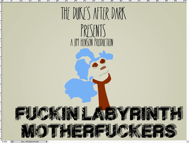
But that was not before this was in first place for a while -
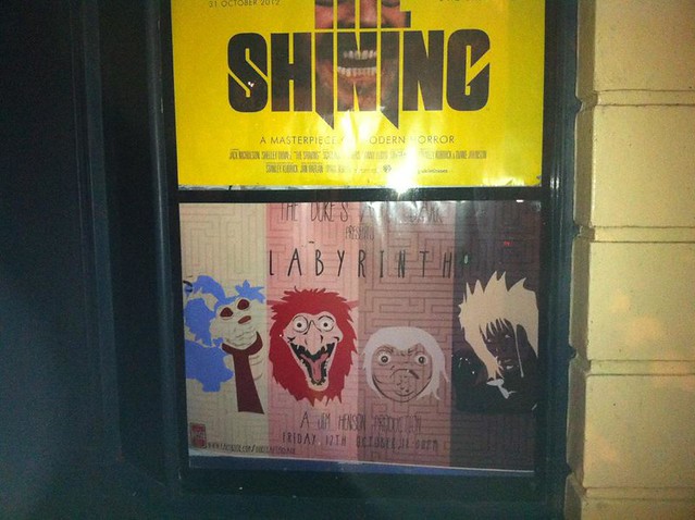
I definitely thought this would look great on the outside of a cinema.
Long story short, my design got picked out of a group of about 4 or 5 other entries, and I was ecstatic. Just seeing something I had created being put on display and being used to advertise one of my favourite films was such a buzz.
 |
| Yup, there it is. Just like I said it was. |
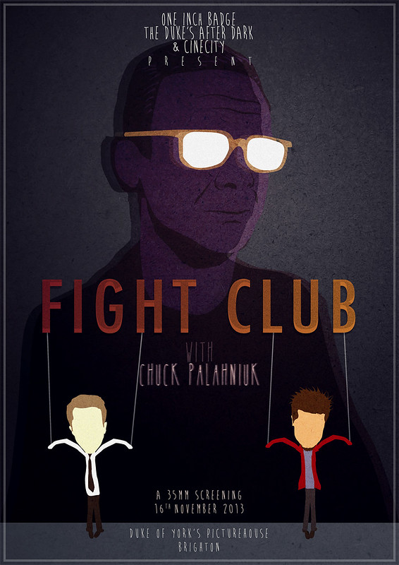
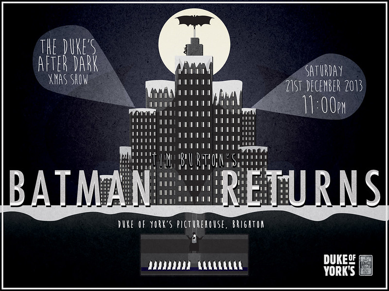
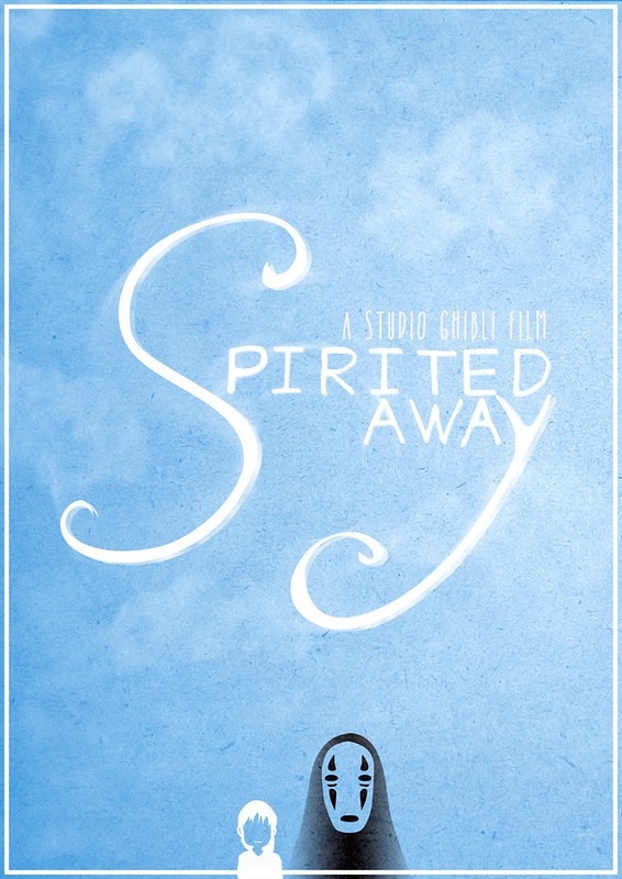
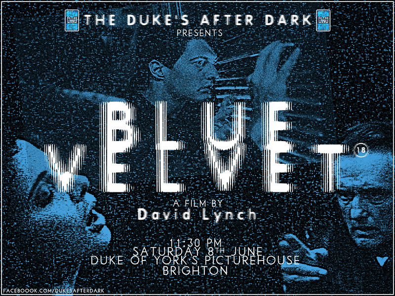
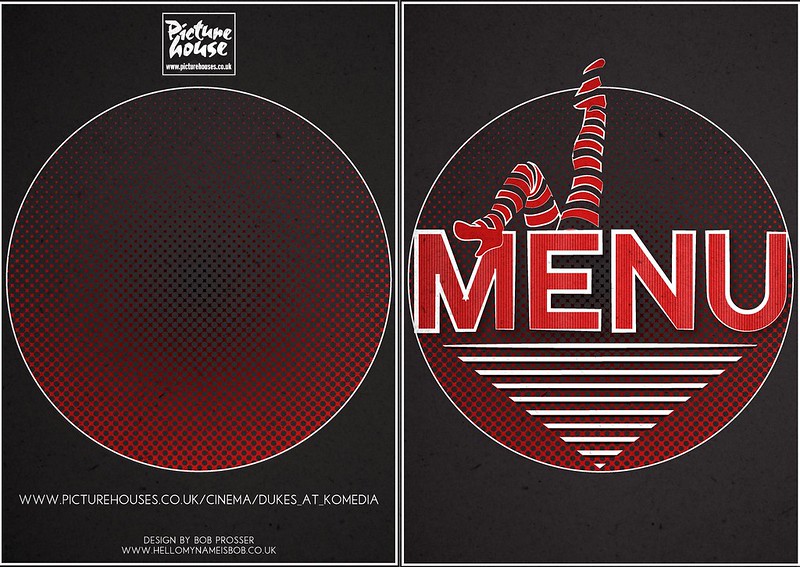
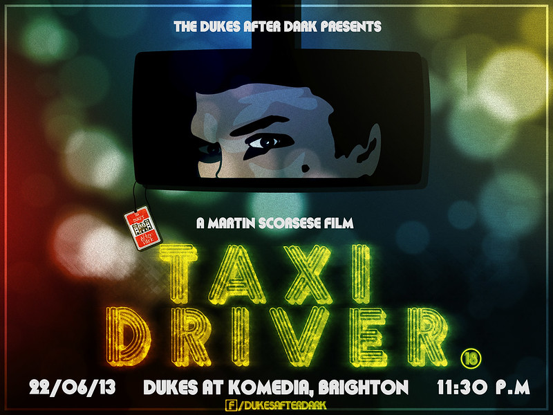
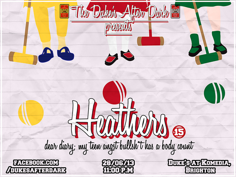
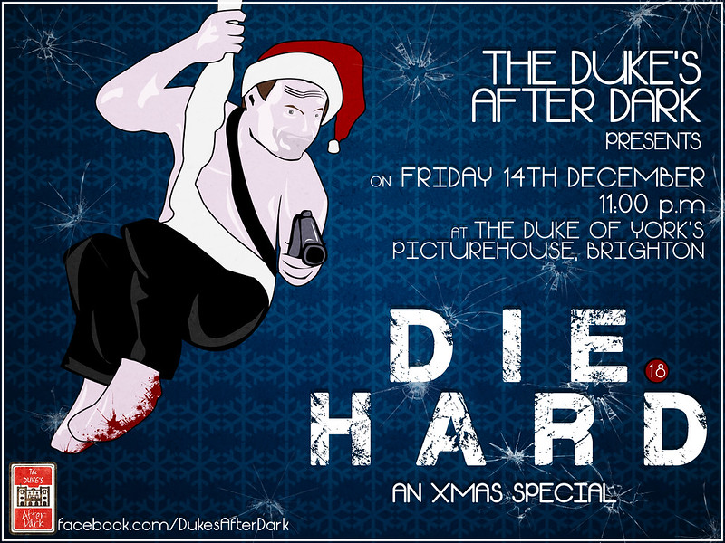
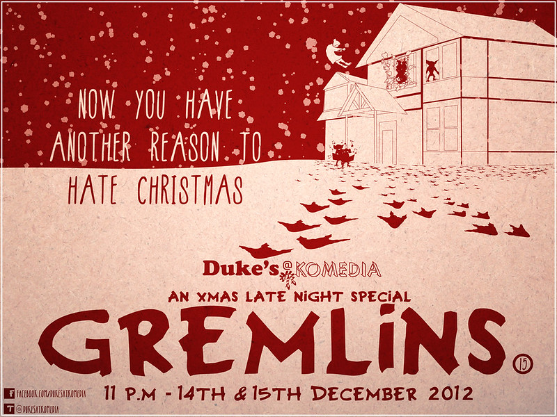
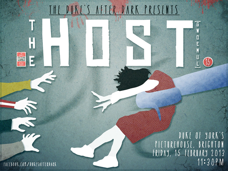
So this was kind of the start of a genuinely fun and great few months, which is still continuing now, of being asked to come up with designs for some of my favourite films. As of yet, all of the posters I have created bar one have been used to advertise the special screenings that are put on by Toby and the lovely people at the Duke of York's. And to be honest, I'm really pleased with how much better I think I've got with each one. But I'll let you decide that for yourself. Here they are in chronological order of creation.
 |
| A special Christmas screening of Die Hard. Probably my least favourite out of the bunch because I feel I messed the text up. |
 |
| Gremlins - this one wasn't used. Sad face. |
 |
| I was incredibly pleased to get a chance to make a poster for this film. Though I only had about three days to make it before I went to Japan for Christmas, I was still happy with the result. |
 |
| Probably my favourite so far. |
 |
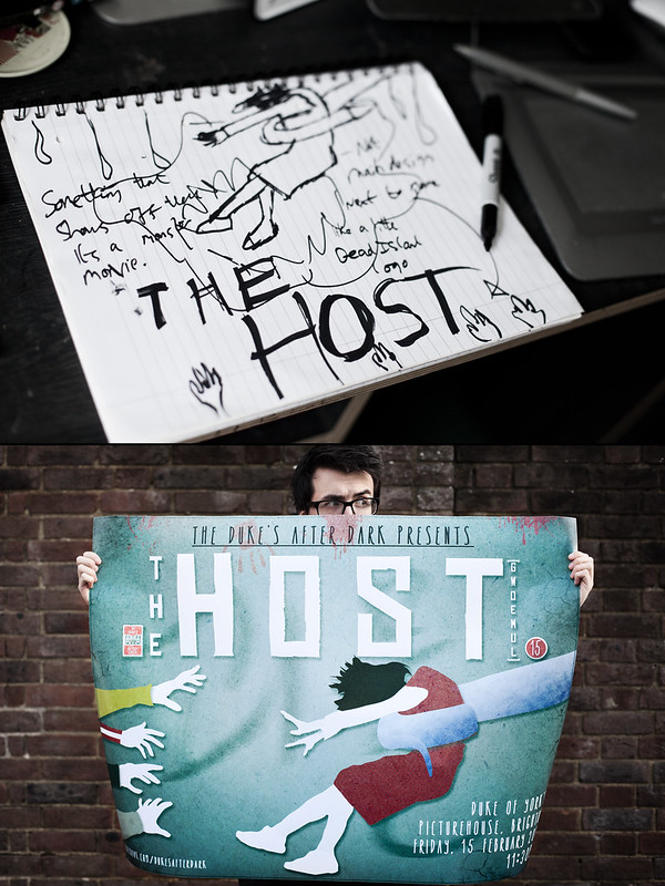
| The most recent. Also, the first where I made the majority of graphics in Adobe Illustrator - I do not know how I managed before. |
I feel really lucky to have had these opportunities to create this artwork for these films. I know it probably sounds horribly lame, but the whole process is so so so much fun to me - sitting down and thinking of ideas, maybe watching key scenes with iconic imagery in, doing research to find any reference images I might need, choosing the colours, perfecting the shapes, seeing the posters up and then getting to keep a copy for myself. It's bloody brilliant. It's just something that I want to keep doing because I know I can get better at it, and I want to get better at it.
 |
| An in-depth look at my creative process |
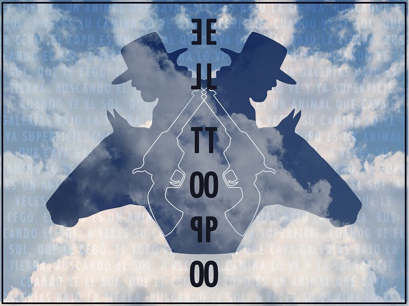
Here are a couple of images I just made for fun.
 |
| Daddy, look! There's a woman outside the window. And she's not touching the floor. |
Mama was not a particularly amazing film, but it made me and my friends jump and had some cool imagery in it and we had a lot of fun watching it. I think I also got popcorn stuck in my beard, which I will never live down. I just had this kind of cool idea for an image stuck in my head when leaving the cinema, mainly because of Mama's creepy ass huge fingers. I feel I managed to sort of include my own drawing style in this poster a bit more than the other posters I had made, which I like that i'm able to do.
 |
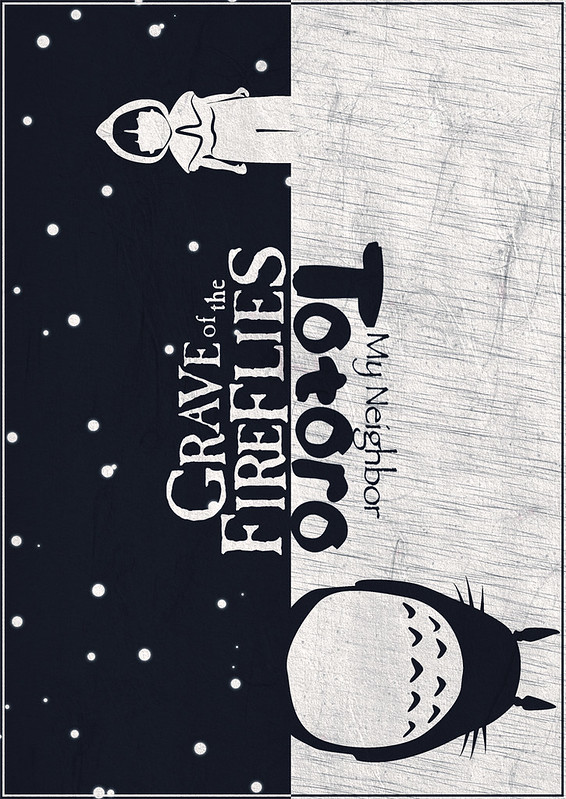
| Chalk and Cheese |
I made this for a competition on the Studio Ghibli fan page on facebook to mark the 25th anniversary of the release of Grave of the Fireflies and My Neighbour Totoro, two of the most iconic Ghibli films. At the time of me writing this, it has had 2,148 likes on facebook, which is
MIND BLOWINGLY cool. Like, beyond words. That many people looked at it and pressed a button to show their appreciation. It doesn't sound like much, but to me it means a whole lot.
So that's what I've been doing a lot of recently. I currently have three more posters lined up, which is very exciting as they're all for awesome films.
To round off, here's a picture of me drinking my cup of coffee I mentioned at the start of this post. What goes around, comes around.
 |
| What mug is it? AAAADVENTURE MUG! |
End.
(also, I should point that I have used a couple of fonts and textures/brushes that I haven't had time to go through and credit, if anyone is curious what they are or annoyed that I haven't put it in, please e-mail me and I will rectify it as soon as I can)
(I feel I should also mention my sorrow at the incredibly sad news that one of my favourite graphic designers/artists/photographers, Storm Thorgerson, has passed away. His work was such a massive influence on pretty much every single photography project I did at university or outside of university for the last five years. Truly a creative genius.)
 |
| RIP |