Monday 2 May 2016

Hausu

Good morning internet! I've just rolled my way over from my other internet platforms for a quick update!

First of all, I am in the process of compiling a new online portfolio on dropr, a very cool website that easily lets you display and arrange your projects for people to browse. If you'd like to have a look at what I've put up there for now, you can see it here - http://dropr.com/hellomynameisbob - or the link is just up in the bar at the top of my blog under 'portfolio'.

Now onto some recent work! If you follow me on any social media platform, you probably would have seen me posting constantly for the last few weeks about a poster I was designing for a screening of the Japanese cult horror very strange and amazing film "Hausu" (or ハウス/House). The screening took place last night and was definitely one of those screenings I will always think fondly of. A classic film with a sold out screen made up of a fantastic audience - those are the cinema experiences you don't ever forget.

The final printed version of the poster!

I had a couple of people come up to me last night asking me how I went about making my posters, so I thought I'd upload a few small images that went through my very messy process of creating things.

First of all, I start with a sketch. This sketch should normally take between 20-40 seconds, and it needs to do two things. I need to think "Hmmm, that could turn out into something interesting eventually". I then need to think "Oh boy, I am terrible at sketching I should just stop right now I can't possibly do this." If it doesn't achieve these two things, then it's not right.

The initial, soul destroying sketch.
Next comes the actual drawing. I have recently taken to starting with a pencil sketch, and then using a small lightbox to trace that and create the inked versions, as oppose to normally just inking over the sketch and then rubbing out the pencil lines.

Light boxin'
At this point I feel slightly less bad about everything and decide to carry on.

So now you're ready to scan the inked versions, and then colour and arrange in photoshop. From using illustrator and photoshop so much in my life, I have became a person who likes to be able to move and rearrange assets that I think I have placed in the right position and then have decided at the last minute that I haven't. This is why, for this poster, I drew all of the assets individually so I could mess around with them later, instead of just drawing the whole poster as it would look at the end. Maybe one day I'll trust myself enough to do that.

Colouring the cat in photoshop. Look at all those delicious layers.
When that's all done and you've got your colours and your effects and your bleeds all sorted out, it's off to the printers and then out into the world for anyone who wants one!

The arrival of the prints.
Make a sign and you're good to go.

So, yeah. That is a small insight into my very basic workflow! I guess the only thing left to say is that you like the look of my work then please like my facebook page or send me a message on there if you're interested in working together!

If you're local to Brighton or the surrounding area and a fan of getting something slightly different from your cinema listings, definitely add Dreamland Cinema and The Duke's After Dark to your Facebook likes and keep up to date with what they're up to.

Monday 29 February 2016

There are now more places to find me on the internet!

Hello again to you, the internet! This is a quick post to inform any newcomers that I now have new places that you can find me on the internet! On Facebook! And on Etsy! Oh boy! Here come the links!

Facebook - facebook.com/HelloMyNameIsBobP/ - This is where I'll be doing my small updates, like things I'm working on and places I'm going to be, while saving this blog for the big posts!

Etsy - hellomynameisbobshop.etsy.com - You can now buy and prints I have for sale! Online! And I'll post them to you! Hooray!

Go to them, check them out, like, favourite, subscribe etc etc etc

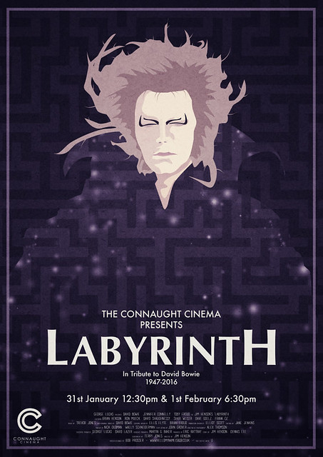
As a reward for doing that, here is a poster that I made for a special screening of Labyrinth following the sad death of David Bowie.


Tuesday 24 November 2015

Brighton Film and Comic Convention 2015


Conventions are fantastic places. There is something so very special about an entire building full of people who are all there because of a shared interest. They are a place to see and discover new things, meet new people or even rekindle an old interest. A place to admire people's effort and work that they put into what they love, and a place to find inspiration for your own talents.

They're also a good place to spend lots of money and get annoyed at yourself for not taking enough money for that thing you've always wanted and you knew it would probably be there and you kind of deliberately didn't take enough money because you thought you might buy it...

and I'm pretty sure these can apply to almost any type of convention, for anyone with any interests. Conventions are special, and I would highly recommend that you find one for something you're interested in and just go to it.

A few weeks ago, the conference hall of the Hilton hotel in Brighton was rammed with guests for the Brighton Film and Comic Convention. As I've written about my interest in visiting conventions before (here and here), I couldn't resist the chance to go to a Film and Comic Convention in my own city.

So now I am just going to overload your browsers with pictures of some of the fantastic costumes and creations that were on show that weekend. These are some of my favourites that I saw, and I can't thank the people wearing them enough for letting me bother them with my camera. Enjoy! Please excuse the varying light conditions. I'm not one for on-camera flash and the lighting was not quite as forgiving as the MCM Expo from the last time I uploaded any cosplay.

Dawn of the Rise of the Cosplay of the Original Planet of the Apes 
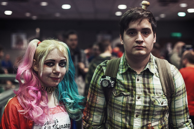
The first 'new' Harley Quinn I saw in the day, accompanied by who I assume is Joel from The Last of Us.
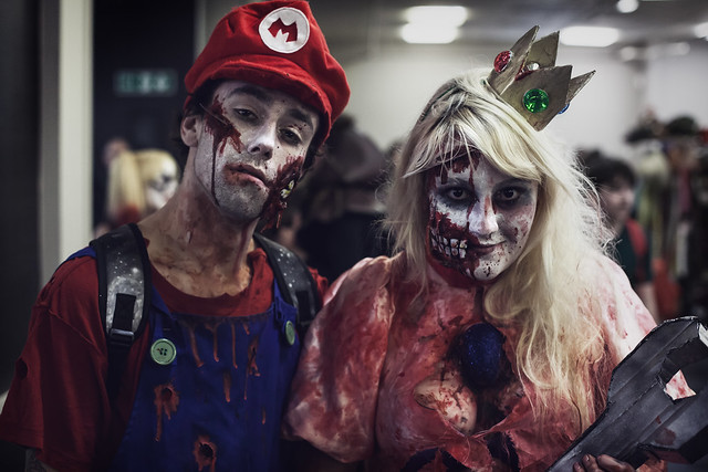
When playing Mario Kart at 200 CC (Reverse) goes horribly wrong... 
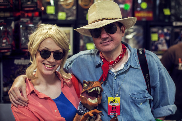
Now-non-canonical-characters have a place to hang out. Apart from that middle guy might be Kylo Ren. He can do what he wants.
After some consideration, I've decided, not to endorse your park...
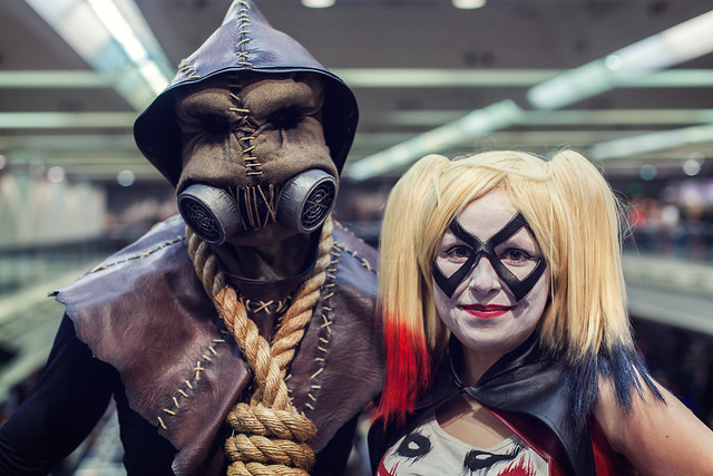
Scarecrow and Harley
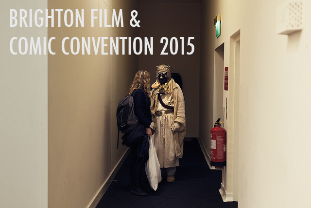
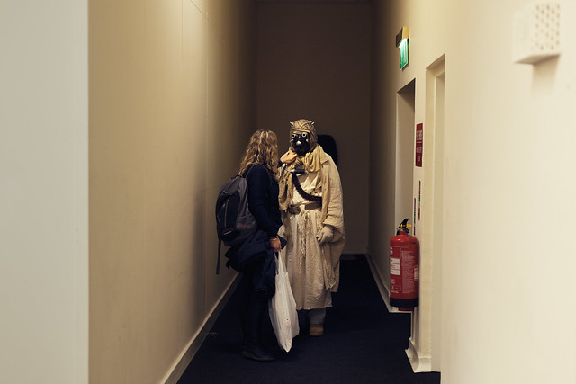
A Tusken Raider gets straightened up before heading out onto the convention floor.
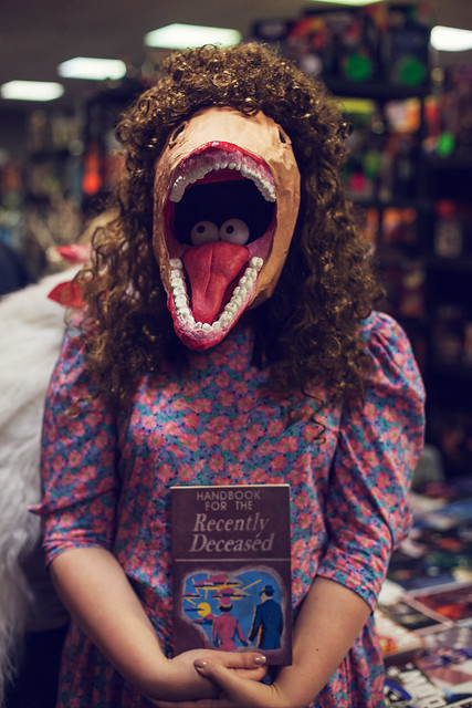
And here we have, I feel, the clear winner of my imaginary cosplay competition - 

Jump in the line, rock your body in time.

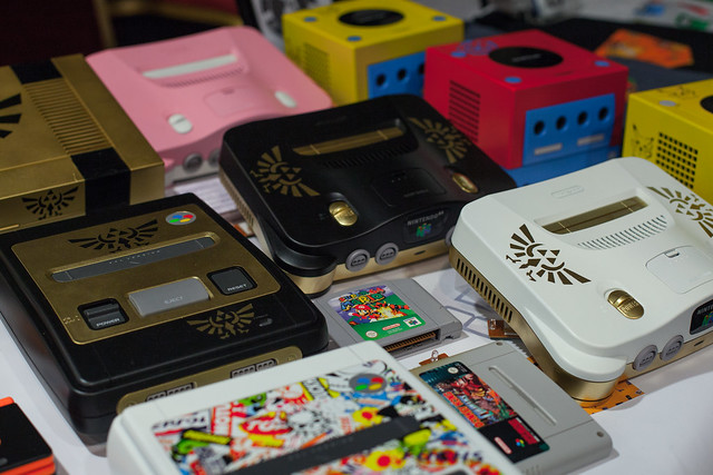
Then came the shopping. After looking at custom Nintendo 64's...


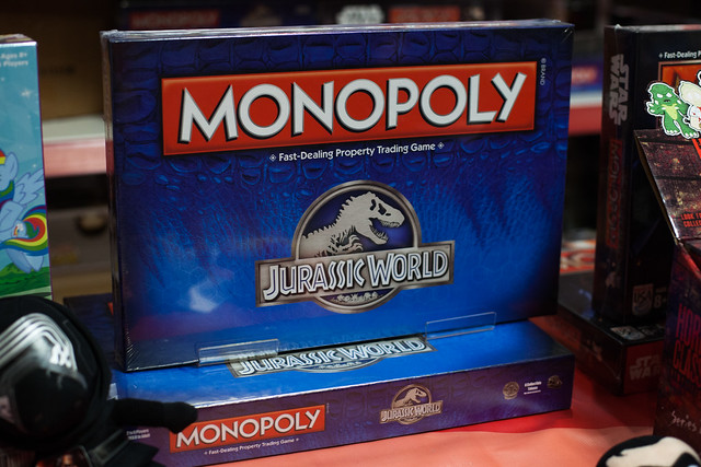
Jurassic World Monopoly...


and an imported copy of Jurassic Park for the Sega Megadrive/Genesis...

...or Jurashikku Pāku to you japanophiles out there...
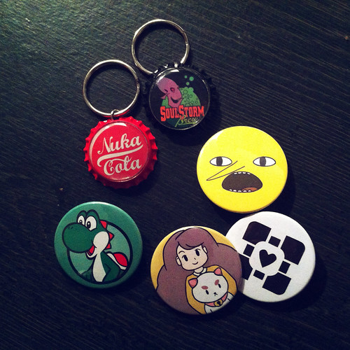
I finally settled on some badges and keyrings, which were much more in my price range.


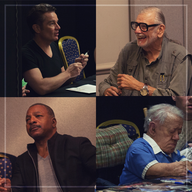
It wouldn't be a complete convention trip without some minor celebrity spotting. Ticked off the list from this one we have -
  • James Marsters
  • George A. Romero
  • Carl Weathers
  • Kenny Baker
...which is a pretty solid victory, if you ask me.


Monday 3 August 2015

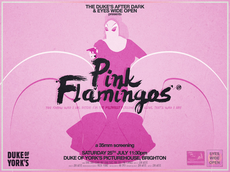
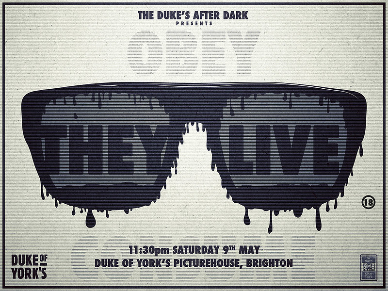
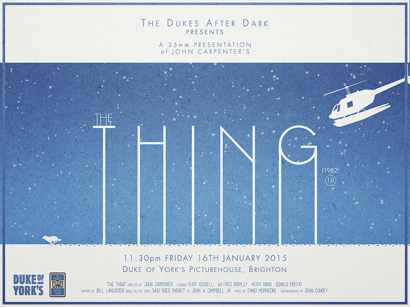
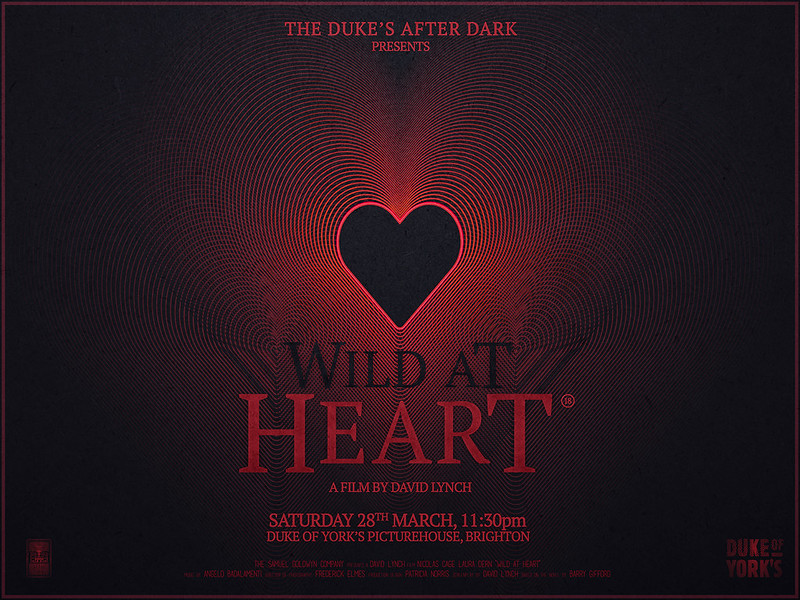
A Year in Posters: Late Night Screenings in Brighton 2014/2015

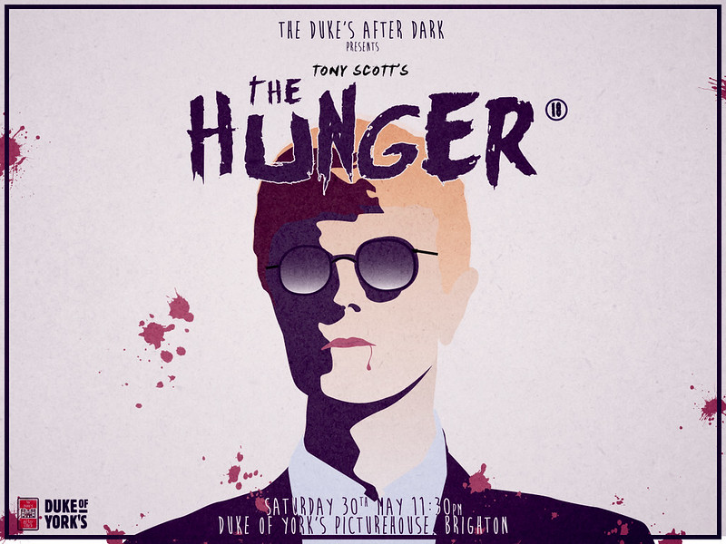
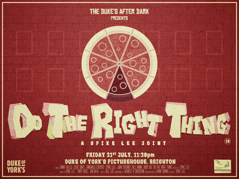
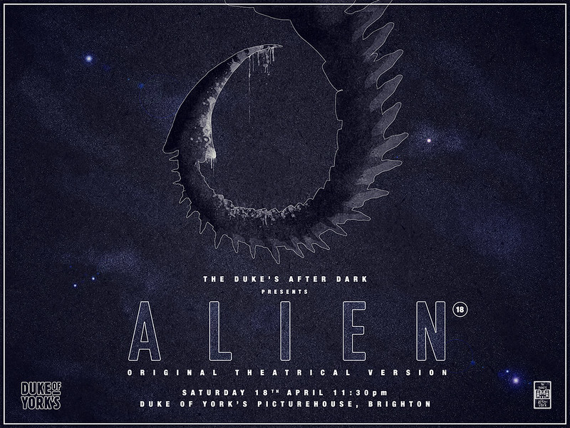
For something I spend quite a lot of my time doing, I realised that I haven't actually posted any of my posters that I have designed for the Duke's After Dark (the late night screenings that take place at the Duke of York's Picturehouse Cinema in Brighton) for about the last year. So here they are! Some of these are probably my favourite pieces of work I've ever made. I still love seeing them up on display and having that opportunity to publicly display my work.


I hope you like them! That's all for now.

Sunday 26 July 2015

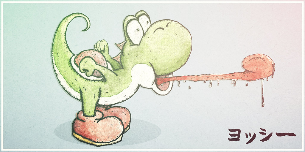
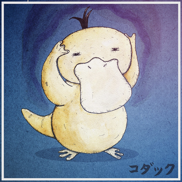
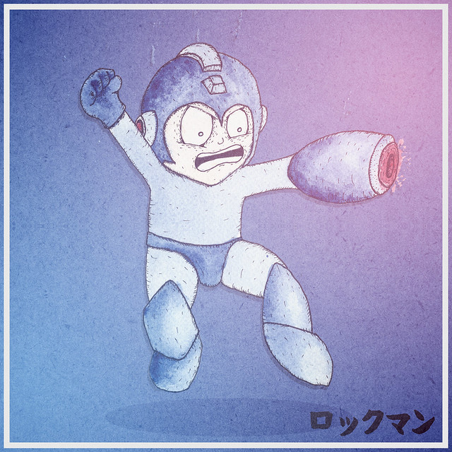
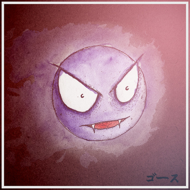
For some reason I've just been drawing a lot of classic video game characters...

Since I last wrote about my love of doodling but lack of skill (way back here in 2013), I have just kind of kept going. More and more, especially over the last year, I have been doodling every week, if not every other day.

Most of my creative time these days is spent using the pen tool on Adobe Illustrator, which is not very similar to the way that I draw at all. I use Illustrator to create, stylistically, very different things to how I actually draw. One day I hope I can smoosh the two together, which is one of the primary reasons I have been wanting to practise so much. It helps me think about shapes, shading, framing and how light is falling on the subject. It's like having to relearn everything I know and love about photography in order to be able to illustrations or designs with the same amount of depth and detail I try to get into my photography

The biggest step for me in this is dealing with colour. Physical, on paper, not going anywhere colour. Digital colouring that I use for my poster designs (and actually for two of these drawings, King Dedede (the penguin with the hammer) and Pikachu) is something that can be altered, changed, inverted or completely removed at the click of a button. These following doodles have all been painted with watercolours, which is something I had never even used up until about a year ago. It has been a real learning process, but has helped with my confidence when it comes to committing to paper. I have started to build up a collection of coloured pens, as well as watercolours and brushes, enabling me to experiment and doodle as I go about my life outside of my flat.
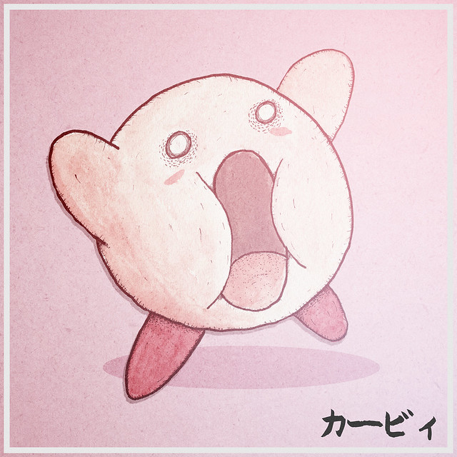
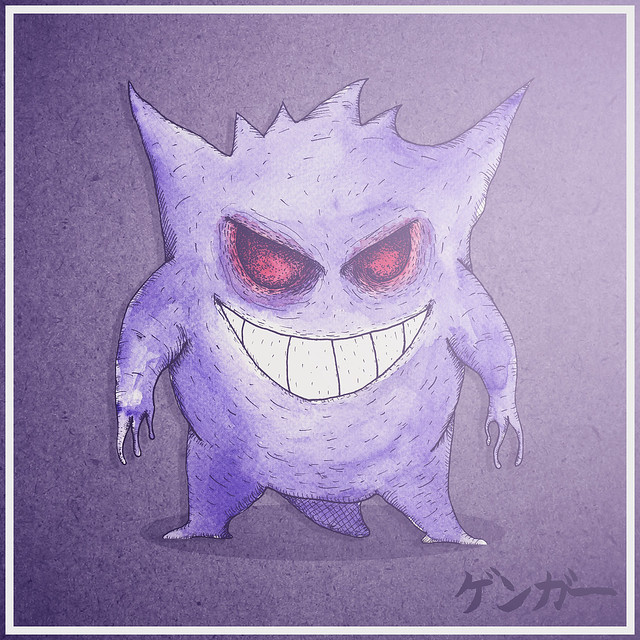
So, here is a collection of classic video game characters, hand doodled and water coloured (apart from, as mentioned, King Dedede and Pikachu, who were drawn, scanned and digitally painted in photoshop). I added their names in Japanese, as originally I had a big awesome font with their western names on...and then decided that it was too distracting. They also serve as flash cards to help me remember my Japanese kana. Also, some coloured lens flare has been added for dramatic effect - not effecting the original colours of the paint too much though.

ENJOY!


Monday 23 February 2015

Death Instinct


If you know me, you know I enjoy creating things and stuff. If you don't know me, you should probably take a moment just to scroll down a bit and have a look at the rest of my blog. I'll give you a minute to do that.

Don't worry, it's ok, you aren't going to miss anything important if you scroll down. That's the magic of text, it will still be here when you scroll back up.

One downside of wanting to work on so many different things is that it can occasionally take quite a long time to get once of the projects done.

This project is one of those things.

Back in November, I had an idea. After I had shot a video on the Nikon D800 with my friend Tom after being nominated for the Ice Bucket Challenge (hey, we were young, everybody was doing it, and if you fancy watching our take on it then you can watch it here) I really wanted to take the D800 and it's not-too-obvious-but-still-cool 60fps to the studio and shoot something with a bit more control. I wanted to try this out with something visually captivating and interesting. I wanted it to be shot in the studio, I wanted there to be movement and I wanted it to grab people's attention. So naturally I asked one of the most talented people I know to be a part of it - Miss Death Instinct. You can see her work here - www.death-instinct.com - and you should be able to see why I envisioned this video with her involved. Her work is so intricate and bewitching, I felt it really suited the use of a slight time shift to highlight how important each action, each movement and each tiny dot is to the completion of the piece.

For some reason unbeknownst to me, the thumbnail is horrible. Please don't let that put you off, it doesn't look like that when you watch it. So watch it.


I had only used the 60fps mode on the D800 while outside, and foolishly hadn't accounted for the refresh rates of the lights when shooting in the studio, so the tech people among you may notice a slight flicker on some of the shots. I know it's there. Don't worry.

This will hopefully be the first of a number of short video projects I have ideas for. One is shot and ready to be edited (and is probably going to end up very similar to this one, but we shall see).

Just to show off the D800's photographic prowess also, here are some images I shot during and after the shoot


Thanks for taking the time to stop by and read this or watch the video or whatever it is you're doing here!